- SAP Community
- Products and Technology
- Technology
- Technology Blogs by SAP
- Card UI Design in a Business Context: A New System...
- Subscribe to RSS Feed
- Mark as New
- Mark as Read
- Bookmark
- Subscribe
- Printer Friendly Page
- Report Inappropriate Content
When I asked my mother what comes to her mind when I say, “card components in mobile apps”, she first gave me a puzzled look, as if I had just asked her to solve a Rubik’s cube blindfolded. With a hint of confusion in her voice, she replied, "Cards? Like a deck of cards on your smartphone? I thought we were done with the whole 'Solitaire' phase."
What is so special about card UI design?
In her defense, it's not every day someone asks about card UI components. But while my mother may have initially misunderstood the concept, there is a little bit of truth in her answer: Cards in apps resemble physical cards, like those found in a deck. This familiarity can actually help users quickly understand the purpose of each card within an app. In fact, even Apple used a design approach called "skeuomorphism" in the early versions of iOS, which aimed to make digital interfaces mimic real-world objects.
Many consumer apps are using card components to provide a clear visual hierarchy, organizing information into brief, self-contained units. This makes it easier for users to scan the app content. Cards are also well-suited for responsive design, enabling adaptation to different screen sizes, screen orientations and device types, such as phones or tablets.
And of course, there are those nice, rounded corners that soften the overall look of the app, making it more friendly and approachable – who knew geometry could be so charming?
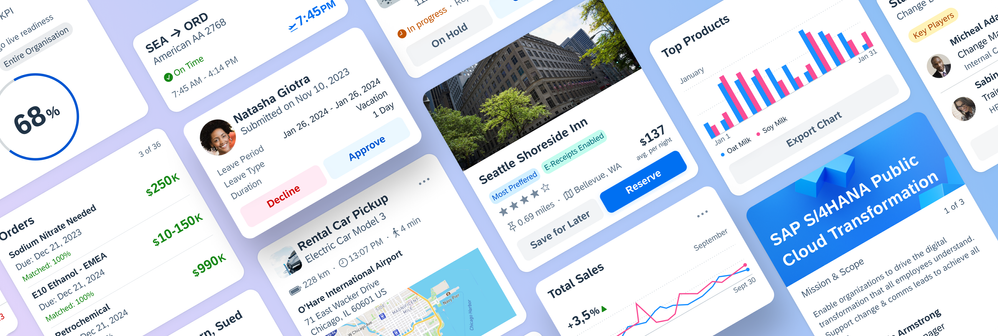
Cards make it easier to scan the app content
Using cards in an enterprise context
The benefits I just mentioned go far beyond consumer apps. In the world of multifaceted software products, where users sometimes struggle with large amounts of information and features, the use of cards can improve the user experience as content becomes more structured and modular.
However, incorporating cards in the context of large software companies just like SAP can also be a challenge as there are many different products with a wide variety of use cases. To address this, the teams for the SAP Mobile Design System and SAP BTP SDK have supported app teams by offering several card types. These card types include object cards, list cards, and chart cards, among others that can be utilized when developing apps.
For example, a maintenance app can use object cards that display important information, such as work order name, description, and priority. The object cards allow users to efficiently manage maintenance activities and monitor progress. Or, in a procurement app, list cards can be used to display the top three pending purchases with additional information such as purchase price and due date that help users prioritize and manage their workload more effectively.
Unfortunately, these card types are not flexibly adaptable or extendable, so that many app teams are forced to design and develop custom cards, which not only adds additional development efforts, but also creates inconsistent cards across SAP mobile apps.
So how can we ensure that our SAP Mobile Design System and SAP BTP SDKs provide reusable card components that are flexible enough to adapt to any use case while maintaining a consistent design?
A new approach to display your business app’s content
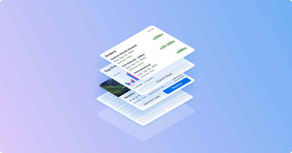
Our solution is a sophisticated “card system” that provides a toolkit of so-called nested components that reside in the card container. These nested components include lists, charts, calendars, KPIs, and many more components to fulfil the needs of any SAP product. Moreover, the card system offers improved customization, flexibility, and adaptable sizing options to fit different layouts, such as a masonry or a carousel layout into which cards can be placed.
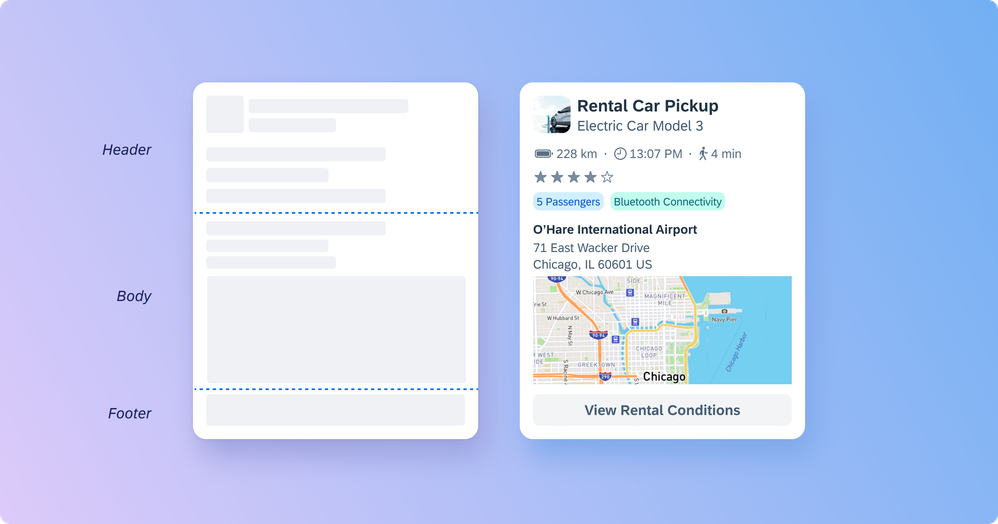
The core of this card component approach is the modular structure of three flexible containers that exist in the card: the card header, the card body, and the card footer. Each of these containers can be separately controlled, adjusted, and switched on or off.
Three separate containers in the card ensure maximum flexibility
But like Solitaire, every good card game also needs a couple of rules. To ensure consistency despite the flexibility of the new card component, we’ve also defined “Do’s and Don’ts” as well as design recommendations within our design guidelines.
The card header displays only key details, such as a title and a subtitle. The card body can show additional information alongside the content of the card header, such as in-depth details, KPIs, or relevant graphics. The card footer is used for important or routine actions that affect the content of the card.
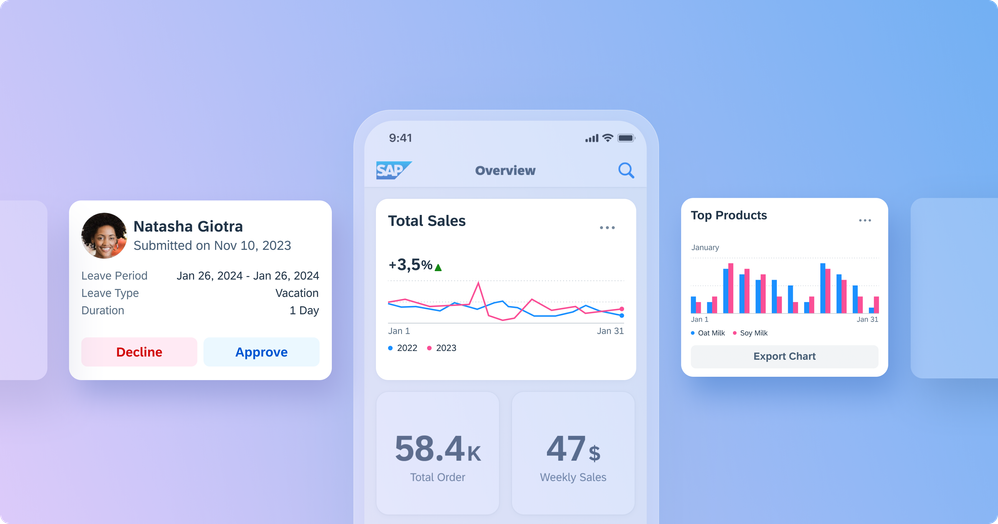
In addition to the card itself, card layouts, such as a carousel or masonry layout can be used to facilitate a quick and modular overview of information across different content resources. Using cards together with card layouts can enable a holistic information approach and ensure an intuitive and frictionless app experience.
Card layouts such as a masonry layout provide a quick overview of various information
Design along various use cases
Before developing the card system, we prioritized gaining a comprehensive understanding of SAPs mobile apps and their specific needs. This included interviews with all app teams and extensive research. Our goal was to identify the common elements found in already existing cards and determine their frequency of occurrence.
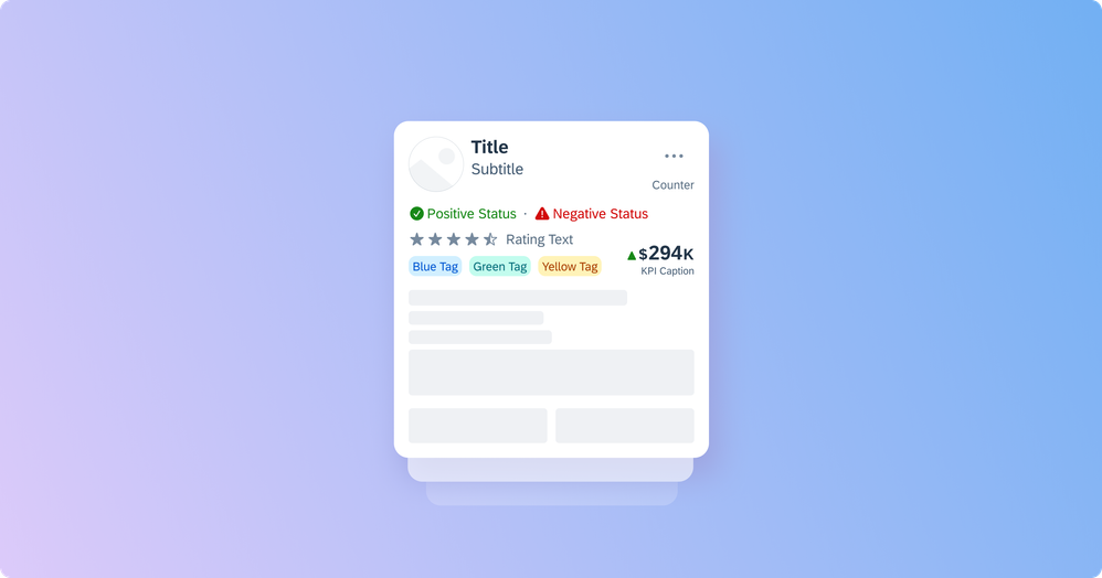
Through this analysis, we discovered, for example, that the existing cards heavily emphasized the uppermost part of the card and often included a title, a subtitle, and a thumbnail. With the insights gained from this research, we began to develop the card system and the above-mentioned header, body, and footer structure, along with a set of recommended components for each part.
Business card UIs often emphasize the uppermost part of the card
Of course, there were also elements that were only used by one single app within cards, such as a QR code. As much as we would have loved to accommodate these special cases (people love QR codes!), we had to stay focused on our main objective: prioritizing the most widely used features.
Testing it regularly
To improve and refine the new card component, we used regular evaluation cycles to test the card system's design and implementation. Getting feedback on our design was really important as it helped us to make necessary modifications and enhance the overall functionality. For example, we incorporated the icon stack component into the card header based on a feedback session with our stakeholders. Furthermore, we plan to continue to gather feedback on a regular basis and to expand the card system in the future.
How to use it
Our card system is now available for designers using our Figma UI Kit of the SAP Mobile Design System for Android and SAP Mobile Design System for iOS, as well as for developers using the SAP BTP SDK for Android and SAP BTP SDK for iOS. This is our initial release of the card system, and we are committed to actively working on enhancing it in future releases. We encourage you to try it out and provide feedback on your experiences! 😊
The card system allows creating a wide variety of card UIs
For more information, explore the card system in our design guidelines for SAP Fiori for iOS or SAP Fiori for Android, and our technical documentation for the SAP BTP SDK for iOS and SAP BTP SDK for Android card component.
Epilogue
Of course, I also read this blog post to my mother. What begins with initial enthusiasm ends 32 seconds later with her picking up her phone and no longer listening. I wondered: Is it because it's my first blog post and I still need to optimize my skills? Is UX design just not interesting enough for a woman who works in elderly care? Or is it simply because she doesn't really understand English...?
After all, the fact that she reached for her phone first shows me one thing: mobile design is relevant. It’s not just my generation or the generation after me that is literally addicted to their phone and would like to perform every activity with it. By pursuing innovative approaches, such as a flexible card system, we can enhance the experience also for business users and simplify digital business processes by using these beautifully rounded corners.
And who knows, maybe one day apps will become “old-fashioned data silos”, thanks to artificial intelligence. AI might be able to condense app content to the point where we will only need to display a widget, a notification, or just one single card.
Special thanks to Janin Stoess, Eva Artinger, Natalie Stainton, Huy Ngo, Cara Stallone, Yuepei Guo, Diana Klukas, Michael Krenkler, Marisa Wollner, Emil Voutta, and all the other colleagues who have contributed to this project at SAP 💙
- SAP Managed Tags:
- SAP Fiori,
- SAP Mobile Services,
- SAP Mobile Platform SDK,
- User Experience,
- User Interface
You must be a registered user to add a comment. If you've already registered, sign in. Otherwise, register and sign in.
-
ABAP CDS Views - CDC (Change Data Capture)
2 -
AI
1 -
Analyze Workload Data
1 -
BTP
1 -
Business and IT Integration
2 -
Business application stu
1 -
Business Technology Platform
1 -
Business Trends
1,658 -
Business Trends
105 -
CAP
1 -
cf
1 -
Cloud Foundry
1 -
Confluent
1 -
Customer COE Basics and Fundamentals
1 -
Customer COE Latest and Greatest
3 -
Customer Data Browser app
1 -
Data Analysis Tool
1 -
data migration
1 -
data transfer
1 -
Datasphere
2 -
Event Information
1,400 -
Event Information
70 -
Expert
1 -
Expert Insights
177 -
Expert Insights
336 -
General
1 -
Google cloud
1 -
Google Next'24
1 -
GraphQL
1 -
Kafka
1 -
Life at SAP
780 -
Life at SAP
14 -
Migrate your Data App
1 -
MTA
1 -
Network Performance Analysis
1 -
NodeJS
1 -
PDF
1 -
POC
1 -
Product Updates
4,575 -
Product Updates
378 -
Replication Flow
1 -
REST API
1 -
RisewithSAP
1 -
SAP BTP
1 -
SAP BTP Cloud Foundry
1 -
SAP Cloud ALM
1 -
SAP Cloud Application Programming Model
1 -
SAP Datasphere
2 -
SAP S4HANA Cloud
1 -
SAP S4HANA Migration Cockpit
1 -
Technology Updates
6,872 -
Technology Updates
468 -
Workload Fluctuations
1
- Tracking HANA Machine Learning experiments with MLflow: A conceptual guide for MLOps in Technology Blogs by SAP
- Tracking HANA Machine Learning experiments with MLflow: A technical Deep Dive in Technology Blogs by SAP
- Going Beyond Traditional Task Mining in Technology Blogs by SAP
- End-to-end Processes and modular processes in SAP Signavio Process Insights, discovery edition in Technology Blogs by SAP
- Embedding Business Context with the SAP HANA Cloud, Vector Engine in Technology Blogs by SAP
| User | Count |
|---|---|
| 18 | |
| 12 | |
| 10 | |
| 8 | |
| 8 | |
| 7 | |
| 6 | |
| 6 | |
| 6 | |
| 5 |
