Overview
The purpose of this exercise is for you to get an overview of the Geo Map feature through an end-to-end use case. Using the Geo Map widget, you can overlay multiple layers of business data on a Geo Map with detailed information to perform analyzes on your geographic data. This exercise will guide you through the preparation of real geographic data and the creation of different types of Geo Maps in a story. In this workflow, we will be using earthquake data from California, however, the goal is to provide you with the ability to apply your learnings to various geographic datasets to find answers to your questions. After this exercise, you should now be able to:
- Import CSV files
- Prepare a dataset and Geo Enrich your data
- Create a Choropleth Geo Map
- Create a Bubble Layer Geo Map
- Add Input Controls
Instructions
This is a guided workflow with detailed instructions provided at each step. Screenshots will be presented throughout the exercise to ensure you are on track. Note that the tasks build on each other, so it’s important to verify that you have completed the steps correctly before you move on to the next section. Be sure to save your work often, especially if you are interrupted in the middle of a workflow. Good luck and have fun!
Note: Some steps may differ slightly depending on the screen resolution and zoom settings of your device.
Dataset and Exercise
Please click the link below to access the data from Github. Click "View raw", then right click, and save as CSV. Before beginning the exercise, confirm the file is named
CaliforniaEQ.csv.
CaliforniaEQ_link
Data Source: This data file is a compilation of years 2017 to 2021 found on Southern California Earthquake Data Center’s website.
SCEDC (2013): Southern California Earthquake Center.
Caltech.Dataset. doi:10.7909/C3WD3xH1
The SCEDC and SCSN are funded through U.S. Geological Survey Grant G20AP00037, and the Southern California Earthquake Center, which is funded by NSF Cooperative Agreement EAR-0529922 and USGS Cooperative Agreement 07HQAG0008.
Scenario
California is prone to earthquakes. You work for an earthquake relief organization in California as a Business Analyst. The organization wants to determine which regions experience the highest frequency and magnitude of earthquakes in order to allocate resources appropriately. You are asked to visualize California’s earthquake data from 2017 to 2021 to show the frequency and magnitude of earthquakes in Californian regions. Earthquakes with a magnitude greater than 6 should be emphasized, and magnitudes below 4 are insignificant. Your dashboard will allow the organization to make data-driven decisions relating to operational activities.
Exercise
Data Preparation
Step 1.1 – Import Data

You have successfully imported data into SAC! Your screen should look like this when you are done.

SS_1.1.png
Step 1.2 – Format and Edit Data

You have successfully prepared, and geo enriched your data! Your data is ready for building. Your screen should look like this when you are done.
Note: SAP Analytics Cloud only supports decimal degree formatting for longitude and latitude (i.e. 33.635, -116.665). These values are used to plot specific geographic locations in Geo Maps.

SS_1.2.png
Story Creation
Step 2.1 – Create New Story
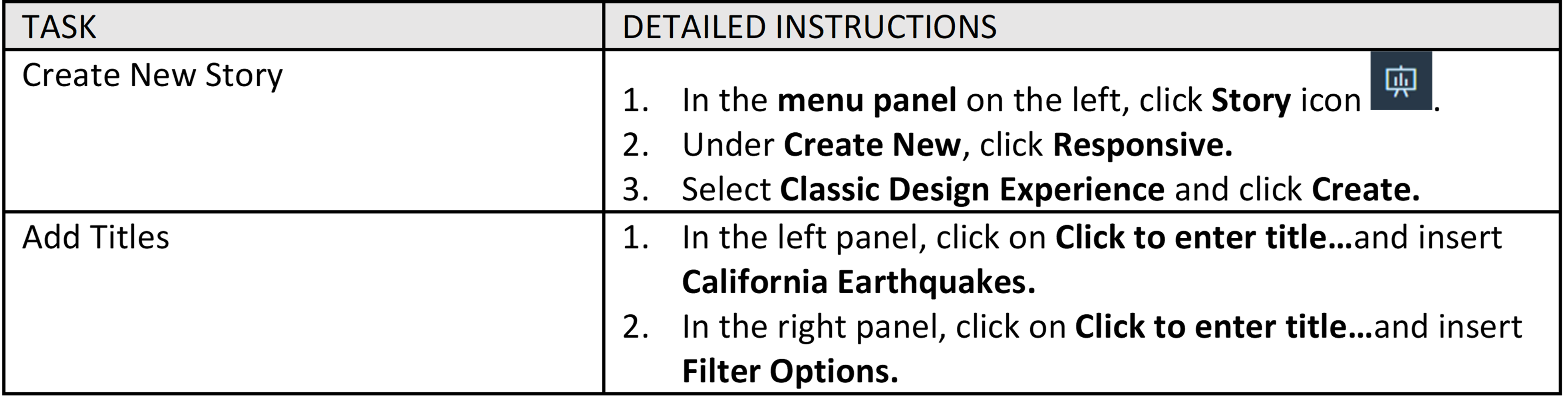
You have successfully created a new story! Your screen should look like this when you are done.

SS_2.1.png
Step 2.2 – Build Dashboard: Choropleth Geo Map
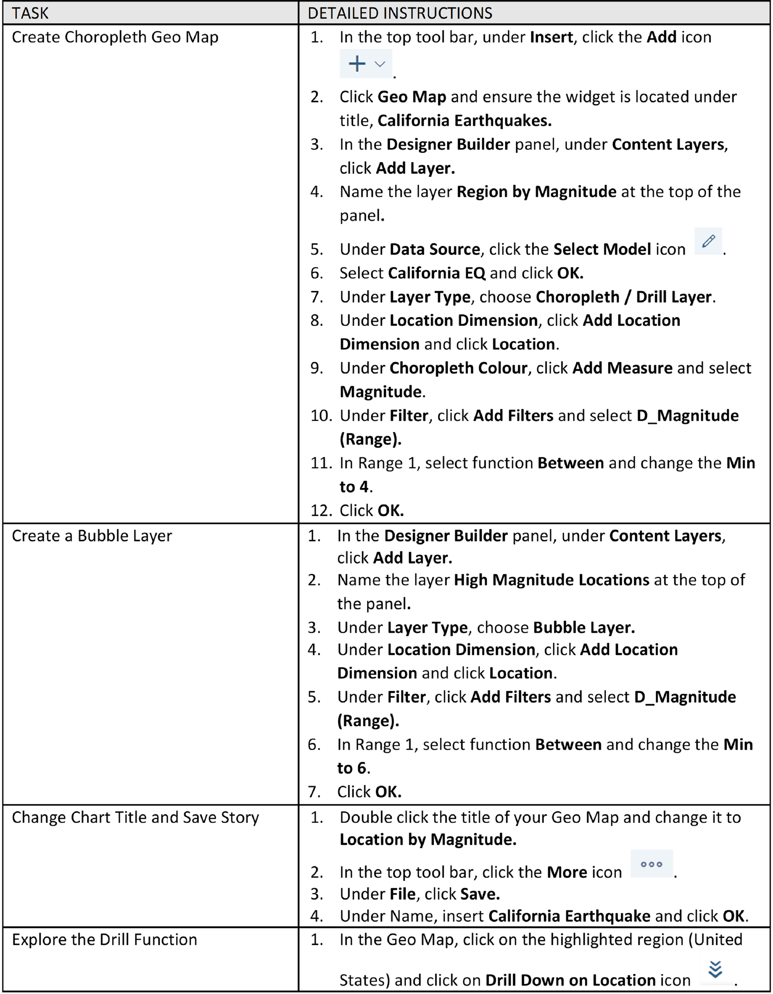
You have successfully added a Choropleth Geo Map that displays Californian regions by magnitude, emphasizing earthquakes with a magnitude greater than 7! Your screen should look like this when you are done.

SS_2.2.png
Step 2.3 – Build Dashboard: Bubble Layer Geo Map

You have successfully created a Bubble Layer Geo Map that displays the frequency of earthquakes by location! Your screen should look like this when you are done.

SS_2.3.png
Step 2.4 – Filter Options

You have successfully created a date and magnitude filter for your Geo Maps! Your screen should look like this when you are done.

SS_2.4.png
Summary
Congratulations, you have completed a common Geo Map use-case in SAP Analytics Cloud! You have created a dashboard using Geo Maps to visualize California’s earthquake data. The Choropleth and Bubble Layer Geo Maps display the magnitude of earthquakes by city, which cities experienced high magnitude earthquakes between 2017 and 2021, and the frequency of earthquakes by location. Your organization will now be able to make data-driven decisions relating to operational activities.
Additional Learning Materials
Author:
Gladys Kwok
