
- SAP Community
- Products and Technology
- Technology
- Technology Blogs by SAP
- Run Simple: Simplifying SAP Lumira 2.0
Technology Blogs by SAP
Learn how to extend and personalize SAP applications. Follow the SAP technology blog for insights into SAP BTP, ABAP, SAP Analytics Cloud, SAP HANA, and more.
Turn on suggestions
Auto-suggest helps you quickly narrow down your search results by suggesting possible matches as you type.
Showing results for
former_member39
Explorer
Options
- Subscribe to RSS Feed
- Mark as New
- Mark as Read
- Bookmark
- Subscribe
- Printer Friendly Page
- Report Inappropriate Content
06-08-2017
11:01 AM
In 2016 SAPPHIRENOW when the convergence of Lumira and Design studio was announced, the biggest challenge for the design teams was to define a simplified user experience for the new converged product. The challenge; merging two user personas with overlaps into one i.e business user’s vs advanced analyst. Design thinking and extensive white boarding helped to clear the challenges and we zeroed on 7 fundamental rules to apply to create a simplified user experience for end users.
It’s a proven fact in human computer interface psychology that users like to know what is going to happen when they are about to take an action, and they have certain expectation of what might happen as a result of their action. This is called mental model. A product is most successful when it understands users mental model and behaves in the same way as the user expects. When we conducted user research on the previous version of the product, the main problem was clearly apparent. Multiple rooms where users had to remember the context of one room to interact successfully with other rooms topped list followed by numerous action panes with different elements placed almost on all sides of the main canvas making users wonder which one to focus. The first thing the design team fixed in the new Lumira 2.0 are these aspects of user’s mental model and making sure that user’s expectations and the focus point is crystal clear while performing a task.
One of the most important factors for end users to have trust on any application is the clarity and consistent behavior it exhibits. This was achieved in the new Lumira 2.0 by a joint exercise with customers to identify to remove unwanted distractions that delays decision making and using SAP.UI.5 controls as the medium to achieve and the same behavior across the product. Below is an example of the Linking dialogue from the product, if you scan the dialogue you notice that only absolutely required information is displayed and the design demands how the functionally should be used without any confusion.

“Less is more” is the principle that the design teams constantly applied while conceptualizing Lumira 2.0 visual design, this basically means that rather than overwhelming users with many alternatives that increases the time for decision making only show what is absolutely required in the context. If you use the product, you will notice that only the top 5 logical action that users might use in the context is shown upfront and the rest of actions in shown in a progressive disclosure method.
The colors palates of the product have been carefully selected that are soothing for the eyes and with the right contrast maintained for easy legibility. The visual theme embraces to reduce visual clutter that are caused by multiple divider lines that blocks easy scanning of the content, also dark colors (that takes more attention compared to other soothing colors) are used only to attract user’s attention when required.

One of the major concern the design team noticed during user research is findability. Sometimes it took a lot of time for end users to find the right action as they were located in multiple locations on the screen, users had to look everywhere. This was taking a toll on the efficiency of the task the user is performing. New Lumira 2.0 user experience is designed in such a way that contextual actions are surfaced right next to the context where the user is performing the task. Its called the Quick Menu, you can notice in the below examples how the application surfaces the most logical actions upfront when you interact with different elements in the product. The navigation of the product is also clearly defined in such a way that it makes is clear where to find global actions vs contextual actions.

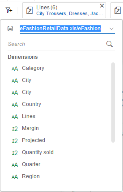
Input control and filters topped the list of problem areas. Many customers had raised concerns about the look and feel, lack of customization option and most importantly findability of the controls that stopped users from efficiently using the functionality. The Lumira 2.0 design team has put their focus on these problem areas and the new experience enables easy insertion of input controls from the top toolbar with improved look and feel and with customization option. The filter dialogue has been made simple and consistent across the product that clearly shows the applied filters on top with the visual cue on the specific context the filter is been applied i.e story level filter, page level or visualization level.
New Input Controls:

New Filter Experience:
Charting or content creation is the area that users spend the maximum time and the most important functionality in the product. Inserting charts, changing chart types, changing color palates, adjusting sizes and location, editing chart title are the top 5 actions users performed repeatedly (stats from user research conducted). The experience of the new Lumira 2.0 is designed to support these top 5 actions easily and upfront.

Lumira 2.0 canvas is ergonomically designed in such a way that story creation is made real easy and graphical elements that you would need while creating a story is availiable right next your canvas that can be easily dragged and dropped without much mouse movement or reduced wrist load . The design tab provides an extensive list of pre defined icons, images, background, shapes and illustrations to make story telling compelling .

 Sujit Ramesh is the Lead User Experience Designer and chief stratergist for SAP Lumira 2.0. He has over 14 years of experience in managing User Experience & design driven applications for Mobile, desktop and cloud. He is also the winner of best Analytics products experience award in SAP with 7 design patents to his credit.

1. Understanding user’s mental model
2. Clarity and Consistency
3. Minimalistic visual language
4. Make actions Contextual - don’t make me look everywhere
5. Focus on problem areas
6. Make charts more engaging and appealing
7. Easy story telling
Understanding user’s mental model
It’s a proven fact in human computer interface psychology that users like to know what is going to happen when they are about to take an action, and they have certain expectation of what might happen as a result of their action. This is called mental model. A product is most successful when it understands users mental model and behaves in the same way as the user expects. When we conducted user research on the previous version of the product, the main problem was clearly apparent. Multiple rooms where users had to remember the context of one room to interact successfully with other rooms topped list followed by numerous action panes with different elements placed almost on all sides of the main canvas making users wonder which one to focus. The first thing the design team fixed in the new Lumira 2.0 are these aspects of user’s mental model and making sure that user’s expectations and the focus point is crystal clear while performing a task.
Clarity and Consistency
One of the most important factors for end users to have trust on any application is the clarity and consistent behavior it exhibits. This was achieved in the new Lumira 2.0 by a joint exercise with customers to identify to remove unwanted distractions that delays decision making and using SAP.UI.5 controls as the medium to achieve and the same behavior across the product. Below is an example of the Linking dialogue from the product, if you scan the dialogue you notice that only absolutely required information is displayed and the design demands how the functionally should be used without any confusion.
Minimalistic visual language
“Less is more” is the principle that the design teams constantly applied while conceptualizing Lumira 2.0 visual design, this basically means that rather than overwhelming users with many alternatives that increases the time for decision making only show what is absolutely required in the context. If you use the product, you will notice that only the top 5 logical action that users might use in the context is shown upfront and the rest of actions in shown in a progressive disclosure method.
The colors palates of the product have been carefully selected that are soothing for the eyes and with the right contrast maintained for easy legibility. The visual theme embraces to reduce visual clutter that are caused by multiple divider lines that blocks easy scanning of the content, also dark colors (that takes more attention compared to other soothing colors) are used only to attract user’s attention when required.
Make actions Contextual - don’t make me look everywhere
One of the major concern the design team noticed during user research is findability. Sometimes it took a lot of time for end users to find the right action as they were located in multiple locations on the screen, users had to look everywhere. This was taking a toll on the efficiency of the task the user is performing. New Lumira 2.0 user experience is designed in such a way that contextual actions are surfaced right next to the context where the user is performing the task. Its called the Quick Menu, you can notice in the below examples how the application surfaces the most logical actions upfront when you interact with different elements in the product. The navigation of the product is also clearly defined in such a way that it makes is clear where to find global actions vs contextual actions.
Focus on problem areas
Input control and filters topped the list of problem areas. Many customers had raised concerns about the look and feel, lack of customization option and most importantly findability of the controls that stopped users from efficiently using the functionality. The Lumira 2.0 design team has put their focus on these problem areas and the new experience enables easy insertion of input controls from the top toolbar with improved look and feel and with customization option. The filter dialogue has been made simple and consistent across the product that clearly shows the applied filters on top with the visual cue on the specific context the filter is been applied i.e story level filter, page level or visualization level.
New Input Controls:
New Filter Experience:
Making charts more engaging
Charting or content creation is the area that users spend the maximum time and the most important functionality in the product. Inserting charts, changing chart types, changing color palates, adjusting sizes and location, editing chart title are the top 5 actions users performed repeatedly (stats from user research conducted). The experience of the new Lumira 2.0 is designed to support these top 5 actions easily and upfront.
Easy dashboards and story telling
Lumira 2.0 canvas is ergonomically designed in such a way that story creation is made real easy and graphical elements that you would need while creating a story is availiable right next your canvas that can be easily dragged and dropped without much mouse movement or reduced wrist load . The design tab provides an extensive list of pre defined icons, images, background, shapes and illustrations to make story telling compelling .
Sujit Ramesh is the Lead User Experience Designer and chief stratergist for SAP Lumira 2.0. He has over 14 years of experience in managing User Experience & design driven applications for Mobile, desktop and cloud. He is also the winner of best Analytics products experience award in SAP with 7 design patents to his credit.- Register for the Lumira Newsletter: http://info.sapdigital.com/LUM-NSLTR-REG.html
- Link back to the Hub: What’s New with SAP BusinessObjects Lumira 2.0 Launch blog series: https://blogs.sap.com/2017/04/18/whats-new-with-sap-businessobjects-lumira-2.0-launch-blog-series/
6 Comments
You must be a registered user to add a comment. If you've already registered, sign in. Otherwise, register and sign in.
Labels in this area
-
ABAP CDS Views - CDC (Change Data Capture)
2 -
AI
1 -
Analyze Workload Data
1 -
BTP
1 -
Business and IT Integration
2 -
Business application stu
1 -
Business Technology Platform
1 -
Business Trends
1,658 -
Business Trends
105 -
CAP
1 -
cf
1 -
Cloud Foundry
1 -
Confluent
1 -
Customer COE Basics and Fundamentals
1 -
Customer COE Latest and Greatest
3 -
Customer Data Browser app
1 -
Data Analysis Tool
1 -
data migration
1 -
data transfer
1 -
Datasphere
2 -
Event Information
1,400 -
Event Information
70 -
Expert
1 -
Expert Insights
177 -
Expert Insights
336 -
General
1 -
Google cloud
1 -
Google Next'24
1 -
GraphQL
1 -
Kafka
1 -
Life at SAP
780 -
Life at SAP
14 -
Migrate your Data App
1 -
MTA
1 -
Network Performance Analysis
1 -
NodeJS
1 -
PDF
1 -
POC
1 -
Product Updates
4,575 -
Product Updates
378 -
Replication Flow
1 -
REST API
1 -
RisewithSAP
1 -
SAP BTP
1 -
SAP BTP Cloud Foundry
1 -
SAP Cloud ALM
1 -
SAP Cloud Application Programming Model
1 -
SAP Datasphere
2 -
SAP S4HANA Cloud
1 -
SAP S4HANA Migration Cockpit
1 -
Technology Updates
6,872 -
Technology Updates
468 -
Workload Fluctuations
1
Related Content
- SAP BTP Innobytes – April 2024 in Technology Blogs by SAP
- SAP Datasphere - Space, Data Integration, and Data Modeling Best Practices in Technology Blogs by SAP
- Deliver Real-World Results with SAP Business AI: Q4 2023 & Q1 2024 Release Highlights in Technology Blogs by SAP
- 2024 SAP Cloud Identity Services & IAM Portfolio: What’s New? in Technology Blogs by Members
- SAP Build and SAP Build Code: Comprehensive Tools for Novice to Expert Developers in Technology Blogs by SAP
Top kudoed authors
| User | Count |
|---|---|
| 18 | |
| 12 | |
| 10 | |
| 8 | |
| 7 | |
| 6 | |
| 6 | |
| 6 | |
| 6 | |
| 6 |