- SAP Community
- Groups
- Interest Groups
- Enterprise Architecture
- Blog Posts
- Practical guidelines to create great architecture ...
Enterprise Architecture Blog Posts
Need a little more room to share your thoughts with the community? Post a blog in the SAP Enterprise Architecture group to explain the more complex topics.
Turn on suggestions
Auto-suggest helps you quickly narrow down your search results by suggesting possible matches as you type.
Showing results for
Product and Topic Expert
Options
- Subscribe to RSS Feed
- Mark as New
- Mark as Read
- Bookmark
- Subscribe
- Printer Friendly Page
- Report Inappropriate Content
10-17-2023
5:42 PM
“A Diagram is (sometimes) Worth Ten Thousand Words” - Larkin and Simon
Summary:
Creating exceptional enterprise architecture artifacts is pivotal in driving successful digital transformations. These artifacts serve as the cornerstone of a company's technological evolution, providing a clear roadmap for navigating the complex terrain of digital change. They are the blueprints that lay the foundation for innovation, efficiency, and competitiveness in business transformation projects.
Visually appealing architecture artifacts will improve understanding and hence lead to better decision-making.
A good artifact:
- Reduces perceived complexity and increases understanding.
- Insights into the emergent properties and interactions that were not anticipated.
- Overview of how the different components work together.
- Visualize the game plan across teams, departments, and stakeholders.
- Easier to find patterns that work well, and look for weak spots, risks and areas of improvement.
This blog provides guidelines on how various visual attributes, like hierarchy, layout, colour, form, graphics, etc. can contribute to the readability of diagrams/models.
Artifacts should be easy to understand, they should provide insights and are aesthetically pleasing.
Why communicating architecture is important?
In today’s transformation projects often non-technical stakeholders (CEO/CFO/CMO) are in decision-making positions. Very technical and detailed diagrams/models that are good for technical discussion become useless in front of the business-driven stakeholder.
Another factor is that society is becoming more geared towards visual communication, and this generates demands for aesthetically pleasing visuals.
As a rule of thumb, design a diagram that can be read in 1 minute, 10 minutes or 60 minutes.
- 1 minute – Immediate and automatic understanding of the intent
- 10 minutes – Highlighting main points and their substance.
- 60 minutes – Study of nuances and interactions
The first impression of an artifact should invite the reader to explore it further.
Steps in communicating architecture: Design to Decisions
Figure 1 - Steps in communicating architecture.
The process for communicating architecture can be divided into six main steps:
1. Design and Compose: Architect/s design artifacts based on the current situation, business aspirations, experience, and industry trends.
2. Build model/diagram: In this step, the architect takes their abstract thinking to make tangible by creating formal semantics. Various standards and tools and standards can be used. This is often determined by the company standards or the preference of the architecture team.
3. Review and publish: Often these are reviewed by various stakeholders and published for wide distribution.
At this stage artifact is ready to be consumed by the reader. Readers can be analysts, developers, managers, end-users, and project managers. Often there is a time delay between these two stages. Also, in many cases reader doesn't get a chance to interact firsthand with an architect.
4. Read and Analyse: Comprehending the architecture starts with reading the documents. Often reader gets an artifact without a thorough walkthrough or background. The suboptimal design of an artifact runs the risk of missing an intent or worse wrong interpretation by the reader
5. Build-mental model (Perception/Insight): The Reader synthesizes information and builds their understanding of the intent and purpose. They carry their perception and insights to the next step.
6. Process and make decisions: The reader understands the importance ready to make decisions.
For all practical purposes, these steps are constantly switching back and forth as various reference, as-is, interim, and target architectures are created throughout the life cycle of the project.
A good artifact is often referred to at various stages of decision-making. It compels the reader to refer to the diagram to discuss, debate, decisions making and provide feedback to the architect.
Creating artifacts is an iterative process. Listen to your reader and observe how artifacts are being perceived and utilized. Strive to make the next version a bit better.
Guideline for visual attributes
Follow these seven guidelines to keep diagrams as simple as possible. Use clear labels, consistent symbols, and minimal text to avoid overwhelming the audience with information.
1. Hierarchy
Provide enough clues to the reader to perceive the main message at a glance. Organize your diagram hierarchically, from high-level views to detailed views. This helps the viewer to derive the level of importance at a glance.
Guidelines:
- Keep it to three distinct visual levels
- Use primary colours for only object that needs immediate attention.
- Use size (large to small), colors (bright to light), pattern etc. to indicate hierarchy
Figure 2 - Sample diagram with clear hierarchy -Reference SAP S/4HANA: Overview on Enterprise Portfolio and Project Management | SAP Blogs
2. Layout
You will need to choose a pattern for the layout that is easily recognizable and fits the underlying message. It guides readers’ eyes on a page to understand the relationship between objects and provides a path to develop understanding. Layout patterns include horizontal (flow from left to right), vertical (hierarchy/tree), radial (Web/spider), or sunrise diagram.
The layout aspect of the diagram includes patterns, grouping, positioning, symmetry, alignment, orientation, and distribution of the white space. Typically process/value flow diagrams are depicted from left to right, while the capability model is drawn vertically.
Guidelines
- Use a recognizable layout pattern (horizontal, vertical, tree)
- Consistent flow pattern (left to right, top to bottom or radial)
- Group objects using borders, colours, and backgrounds.
- Provide enough white space.
- Make it symmetrical and balanced on a page.
- In a set of diagrams (baseline, transition, target) similar objects should have a similar position.
Figure 3 - Radial layout to link business capabilities and solution capabilities.
3. Forms of objects, size and width
Typically, you will use two types of objects 1) Shapes such as boxes, circles, diamonds etc. 2) Icons such as cloud, data store, message etc.
Guideline:
- Use equal size and width. Deviate only if you want to signal hierarchy/Importance
- Don’t use more than six different forms in one diagram.
- Use standard objects as per normal conventions.
- Use a grid to align them so they look balanced on the page
Size and width are important visual attributes. It gives a strong size signal in real life. A larger box or larger icon can be easily perceived as more important.
Figure 4 - Sample diagram to illustrate forms and objects - https://blogs.sap.com/2022/11/14/querying-sap-data-warehouse-cloud-from-amazon-athena-using-amazon-a...
4. Colors
Colors bring life to the diagram. Normally it is influenced by the organization's color schema or brand. Using a particular group of colors can consistently convey meaning throughout a set of artifacts. For example, colors by business domains (Finance vs Production) or colours architectural domains (Business vs Application). Colour and color shading is typically combined to build a hierarchy.
Guideline:
- Practice restrain and use a maximum of six colors in one diagram
- Use color to group objects when positioning, grouping, and alignment is not possible
- Bright color signal noise so use light and non-primary colors
- Use consistent colors throughout set of artifacts
- Be aware of color blindness and printing in black & white. Use various shades.
Figure 5 - Sample Diagram – Text and colors (Business Capability Model - SAP Reference Business Architecture)
5. Arrows and Connectors
Arrows and connectors are a must in process, data, security, and technology diagrams. The more precise the diagram more arrows and connectors it will need. You will need to balance between abstraction and comprehension. Too many arrows and connectors make the artifacts look chaotic and messy.
Guideline:
- Use standards such as BPMN, UML
- Avoid unnecessary bends while connecting objects.
- Use a ‘rounding’ bend to give a more natural impression of flow.
- Avoid drawing parallel connectors that are too close together.
- Use the minimum number of arrow types, line widths, and line types (solid, dash, double)
- Reduce additional elements such as different arrow types, termination points etc.
Figure 6 - Block Diagram (Technology Architecture Modeling)
6. Text and Fonts
Text as proper titles, subscripts, and annotation is the key to conveying meaning without providing an explanation. It speeds up interpretation and, hence builds a mental model. It also helps standardize vocabulary across various groups. Using standard taxonomy throughout helps the reader to build an association. Fonts are used to build a hierarchy of importance. Balance the use of text with graphics/icons in a way that complements each other and avoids duplicating information. For example: if you are using a graphic for ‘user’ then add a subtitle as with a ‘persona’
Guidelines:
- Use active voice
- Use plain english (and avoid jargon)
- Define taxonomy (naming standards)
- Use subtitles or footnotes to provide more information without adding to clutter
- Use font size to indicate titles, subtitles, footnotes
Figure 7 - End-to-End Processes for Professional Services (Signavio Process Explorer)
7. Icons and pictograms (Graphics)
Icons and pictograms fast-track understanding of technical diagrams, especially for non-technical readers. Using graphics can save space while improving recognition. Using icons and pictograms also depends on the company and/or software context. You will need to be aware of the meaning and clarity of the chosen icon/pictogram as it should not convey different meanings to different readers/contexts. You will need to be aware of using graphics and logos with copyrights.
Guideline:
- Use modestly in combination with texts.
- Be aware of company and culture.
- Use graphics that are relatable in real life for the wider audience.
- Avoid similar-looking icons/pictograms to convey a different meaning.
- Don’t try to be funny.
Figure 8 - Source: openSAP course “An Enterprise Architect’s View on SAP Business Technology Platform” : https://open.sap.com/courses/ea2, Lean Enterprise Architecture Toolkit Templates, version 1.0, 2021-Feb
Refence presentation with guideline - Follow TERMS OF USE FOR THE SAP CLOUD PLATFORM SOLUTION DIAGRAMS, DESIGN ELEMENTS & ICONS and always refer to the latest guideline from SAP.com.
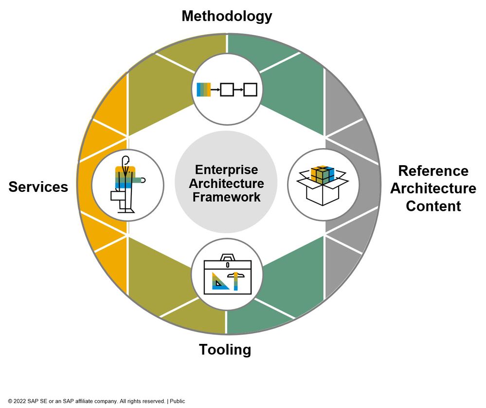
Tools
One can use a variety of tools to create individual artifacts including SAP Enterprise Architecture Designer, LeanIX, Signavio Process Manager, Visio, Draw.io, PowerPoint etc.
However, there needs to be another discussion on using the Enterprise Architecture Management (EAM) tool to build, manage and distribute artifacts. The topic of utilizing technology/software to manage overall Enterprise Architecture Management (EAM) is not covered in this blog. This topic can be a different blog/discussion.
Communicating and conveying details
An architecture diagram/model is an abstraction of the available information hence by definition details do get lost. The real use of a diagram is to convey enough details and with lots of understanding for the reader. The following matrix shows the Burtlon NICE Model.
Figure 9 - The Burlton NICE model
Architecture diagram/model falls into one of these buckets. As an architect, we should strive to create a diagram/model that falls into the top quadrant.
- Naïve: This type of model does not have a lot of details and conveys little understanding. This may be a good start for the executive presentation at the beginning of the transformation, but one doesn’t need to stay here for too long. One can use the hierarchies discussed above to develop meaningful understanding.
- Incomprehensible: Includes an incredible amount of details that typically overwhelms reader (especially if it’s not their core area of interest). This will convey little understanding and the reader will abandon any efforts to understand.
- Complex: This is an in-depth view of an architecture/model. Readers will need to spend time to comprehend details to gain understanding. The project will require this type of diagram/model to describe business processes/technical details. This type of diagram model should be targeted to a specific set of readers.
- Elegant: Abstraction is simple enough so that it is easy to understand but at the same time conveys a rich understanding of the content. Readers can gain sufficient knowledge to make informed decisions.
It’s not practical for an architect to create an Elegant model the first time, but continuous active feedback and iteration cycles will get you there.
Conclusion:
A well-crafted enterprise architecture artifact is critical in driving successful digital transformations. These artifacts provide a roadmap for navigating the complexities of change, emphasizing the significance of visually appealing and clear diagrams.
It also highlights the need to cater to non-technical stakeholders and the growing importance of aesthetically pleasing visuals. Follow seven guidelines for creating diagrams that can capture and communicate architecture's essence, with an emphasis on artifacts that invite exploration. The Burtlon NICE Model provides insight into balance details and understanding while creating abstraction to build a diagram/model.
A Diagram is (if designed right) Worth Ten Thousand Words”
I am looking forward to comments and feedback from the community!
References
- Practical guidelines for the readability of IT-architecture diagrams, H. Koning, C. Dormann, H. Vliet, Published in ACM International Conference 20 October 2002, Computer Science
- Business Architecture Essentials: The Business Architecture Landscape, Business Rules Journal, Roger T. Burlton Vol. 18, No. 4, (Apr. 2017) URL: http://www.brcommunity.com/a2017/b902.html
- Jill. H. Larkin, Herbert A. Simon, Why a Diagram is (Sometimes) Worth Ten Thousand Words, Cognitive Science 11, 65-99 (1987)
Reference for images (accessed on October 15th 2023):
- Be Visual! Use Official Icons and Samples for SAP Business Technology Platform Solution Diagrams | S...
- AI Built for Business | SAP Sapphire | SAP News Center
- SAP S/4HANA: Overview on Enterprise Portfolio and Project Management | SAP Blogs
- Querying SAP Datasphere from Amazon Athena using Amazon Athena Federated Query | SAP Blogs
- Signavio process explorer
- SAP Business Accelerator Hub
- SAP Managed Tags:
- Digital Transformation
5 Comments
You must be a registered user to add a comment. If you've already registered, sign in. Otherwise, register and sign in.
Labels in this area
-
Application Architecture
23 -
Business Architecture
33 -
Data Architecture
19 -
Emerging Trends
20 -
Enterprise Architecture
53 -
Frameworks
20 -
Hybrid and Multi Cloud
3 -
Innovation
14 -
Integration Architecture
16 -
Portuguese
1 -
Roadmaps
12 -
Skills and Learning
29 -
Solution Architecture
22 -
Sustainability
3 -
Technology Architecture
23 -
Tools
14