- SAP Community
- Groups
- Interest Groups
- SAP Builders
- Blog Posts
- Custom Component, Part 2: How we built and shared ...
- Subscribe to RSS Feed
- Mark as New
- Mark as Read
- Bookmark
- Subscribe
- Printer Friendly Page
- Report Inappropriate Content
See all 3 parts of the custom component series:
Both the tooltip and Fiori dialog are available for use now. |
We started by taking a blank project and adding the following components:
- Container (this we need because all custom components need to be housed in a container)
- Icon (users will click this to show the tooltip)
- Container (this will be the background of our tooltip)
- Text (this will be the tooltip)
Select the icon component and change the icon to display the information Fiori icon.
For the inner container, set the spacing:
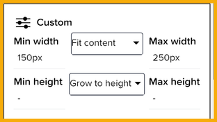
- Width should be set under Custom, with Fit content and minimum 150 pixels, maximum 250 pixels. The height and width should be Fit Content.
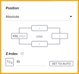
- Position should be absolute, with an indent of 24 pixels, and a Z-index of 10 (click Set to Number and then type in 10) so it displays on top of any other components.
- Under Style, set the padding to 4 pixels on all sides. You can also set a shadow if you want.
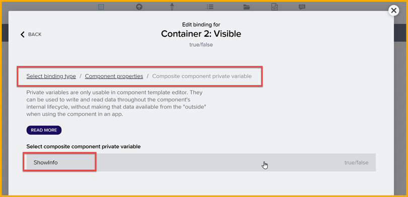
- And we want to show the container only when the user clicks the button, so under Properties → Advanced Properties → Visible, we bind the visibility to the ShowInfo private variable.
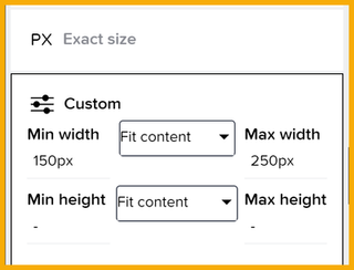
For the Text component, we need to also set the width to Custom, and select Fit Content and minimum of 150 pixels and maximum to 250 pixels. The height should be Grow to height.
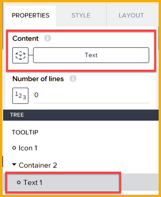
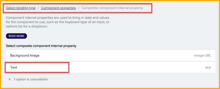
And we need to bind the Text component's Content property to our custom component's Text property, so developers can set the text.
The property appears under Composite component internal property.
You can also set the color of the icon, text container, and text.
Assign Logic
Now we want the tooltip to appear when the user clicks the icon, and disappear on another click. We will also make the text disappear automatically after 5 seconds.
In the Component Template Editor for the custom component, add a set private variable flow function, and set our ShowInfo private variable to a formula to toggle its state:
!privateVars.ShowInfo
You can now save the project and test the component. If you click the icon, you should see the tooltip with default text.
Let's add the feature to automatically hide the tooltip after 5 seconds. We add the following:
- If condition, to test if the tooltip is still visible.
- Delay, to delay 5 seconds if the tooltip is visible.
- Set private variable, to turn our private variable to false.
Publishing the Component
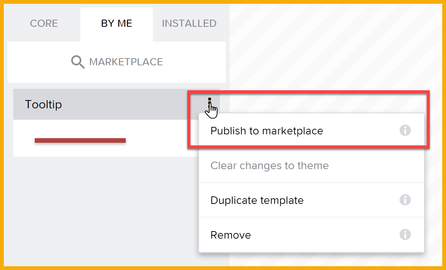
The component you created is under the By Me tab (where the components are shown), which shows the custom components you have modified. This new component will only be in your project. If you want to share or reuse, click the 3 dots and select Publish to marketplace.
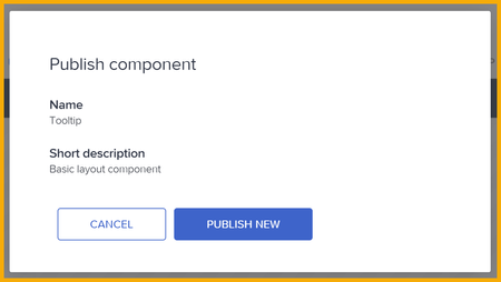
Then select Publish New. This makes it available to any user in your BTP landscape (e.g., eu10).
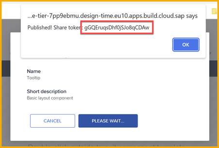
You will get an alert with the token for finding your component in the marketplace. Save this token.
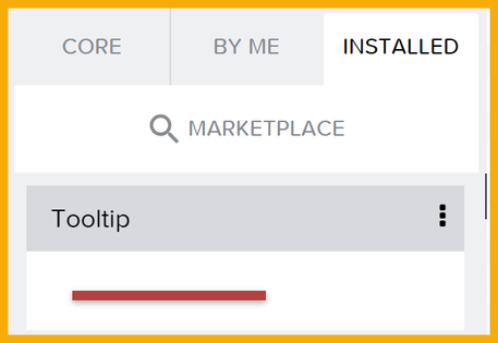
The component is now removed from the By Me tab and moved to the Installed tab.
The component can be found in your subaccount by searching for the title or description. Any other user in the BTP landscape will need the token.
Using the Component
Let's say we had a UI with 2 buttons and we wanted to put the tooltip in the middle.
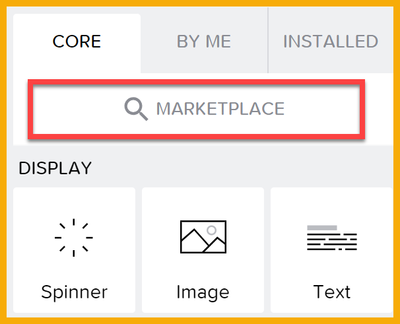
We can click on Marketplace.
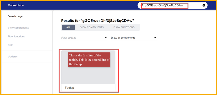
Enter the token, and the component is displayed.
Click on the component, and click Install. It will be in the Installed tab.
Now drag a copy of the component between the buttons.
With the tooltip selected, in the Properties tab, add some text. I added this using a formula (if you add as plain text, the slashes will be escaped). You can use the Unicode characters to add spacing or special characters.
"This is the first line of the tooltip. \u000A\u000A This is the second line of the tooltip."
If you preview the app, you will see that it creates a lot of extra space, and the tooltip is masked by the container in the app.
So you must do the following:
- For the container holding the buttons and the tooltip, set Layout → Layout → Clip overflowing content to No.
- For the tooltip component, set Layout → Width and Height to Fit content.
- For the tooltip component, set Layout → Position → Z-index to 10.
And now run the app again, and click the icon.
- SAP Managed Tags:
- SAP Build,
- SAP Build Apps
You must be a registered user to add a comment. If you've already registered, sign in. Otherwise, register and sign in.
-
1H 2024 Product Release
1 -
Advanced Edition
1 -
Approval Workflows
1 -
Automating Processes
11 -
aws
1 -
BTP
1 -
Building Sites
7 -
Citizen Development
22 -
Contest
1 -
Developing Apps
26 -
Developing with SAP Integration Suite
2 -
Extensibility
1 -
Fusion Teams
3 -
Getting Started
24 -
How I Did It
21 -
Migration
1 -
Pro Development
6 -
Product Updates
2 -
Product Updates
1 -
SAP BTP Innovation
1 -
SAP Build
7 -
SAP Build apps
8 -
SAP Build CodeJam
1 -
SAP Build Process Automation
8 -
SAP Build work zone
7 -
SAP Integration Suite
1 -
SAP S4HANA
1 -
SAP Signavio Process Insights
1 -
SAP Signavio Process Intelligence
1 -
Standard Edition
1

