- SAP Community
- Groups
- Interest Groups
- SAP Builders
- Blog Posts
- Custom component, Part 3: Add Fiori-like dialog to...
- Subscribe to RSS Feed
- Mark as New
- Mark as Read
- Bookmark
- Subscribe
- Printer Friendly Page
- Report Inappropriate Content
See all 3 parts of the custom component series:
Both the tooltip and Fiori dialog are available for use now. |
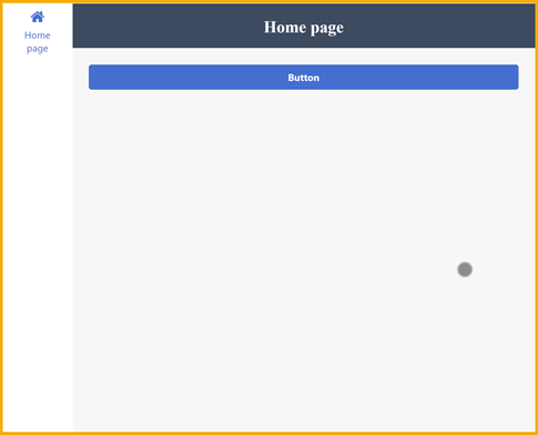
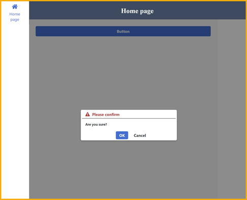
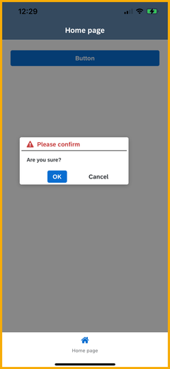
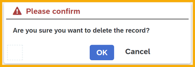
2 great colleagues of mine, Niall Comer and Conor Brennan, from the Customer Success’s Center of Excellence in Ireland, created this Fiori-type dialog for SAP Build Apps. It allows you to customize the buttons, label and message, and grays out the screen while the dialog appears. It also centers the dialog, whether you are on the web or on mobile, and re-centers as the web screen is resized.
On mobile it looks like this:
I took what they did and created a custom component, whose token is (in EU10 only):
Qfptkoc4OFmK-fu8M0g1qg
Go to the component Marketplace (EU10 landscape only) and search for this token, and install the component.
- In case you are not on EU10, I have also published an app that includes the component so you can see how it works and is built.
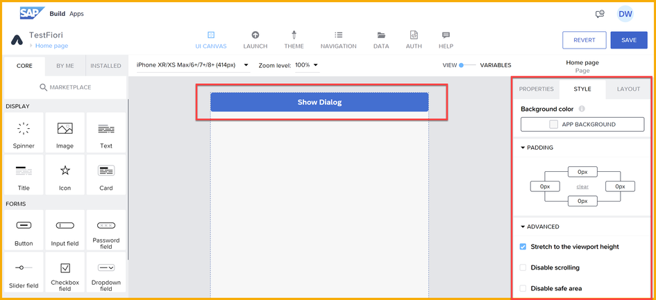
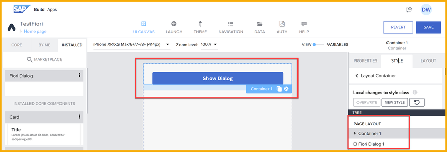
To test it, remove all components except for a container, and a button inside the container.
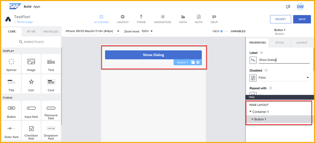
To the container, set Style → Padding to 24 pixels on top, left, and right, to restore the padding.
Add the Fiori Dialog component outside the container, at the bottom.
Set the following properties for the Fiori Dialog component:
- warning label
- warning message
- warningButton
- warningShow – this turns on the dialog. Create a page variable of type true/false and bind the page variable to this property.
Setting up the component
In addition to the above properties, you need to do the following on the Fiori DIalog component:
- Bind Properties → Advanced Properties → Visibility to your page variable, but also set the Set preview value to false.
- Set its Layout → Position to Absolute, and it's Z-index to 100.
- Set its Layout → Width and Height to Custom, and select the following:
- For width, select Set Width, and set the width to the formula: systemVars.dimensions.screen.width
- For height, select Set Height, and set the height to the formula: systemVars.dimensions.screen.height
- Still with the component selected, go to Style → Default → Edit, and edit the styles of any of the components inside (like the color of the icon/label, or the type of icon). You must set the Background color of the BackgroundBlur component to black with 45% transparency (you will create a new color palette).
Add logic to your button to set your page variable to true, so the dialog appears on button click.
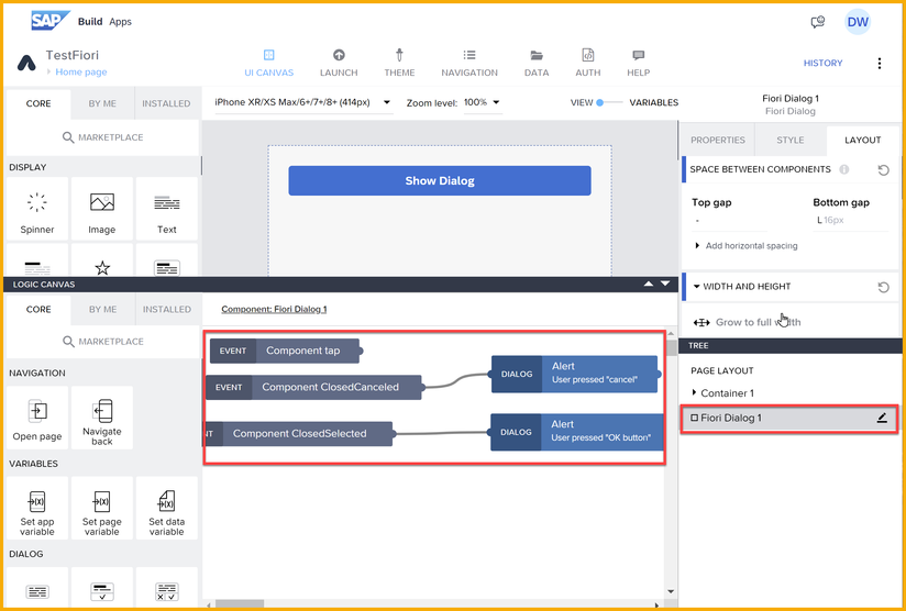
Add event handlers for ClosedSelected and ClosedSelected events to perform the appropriate actions based on the user's actions.
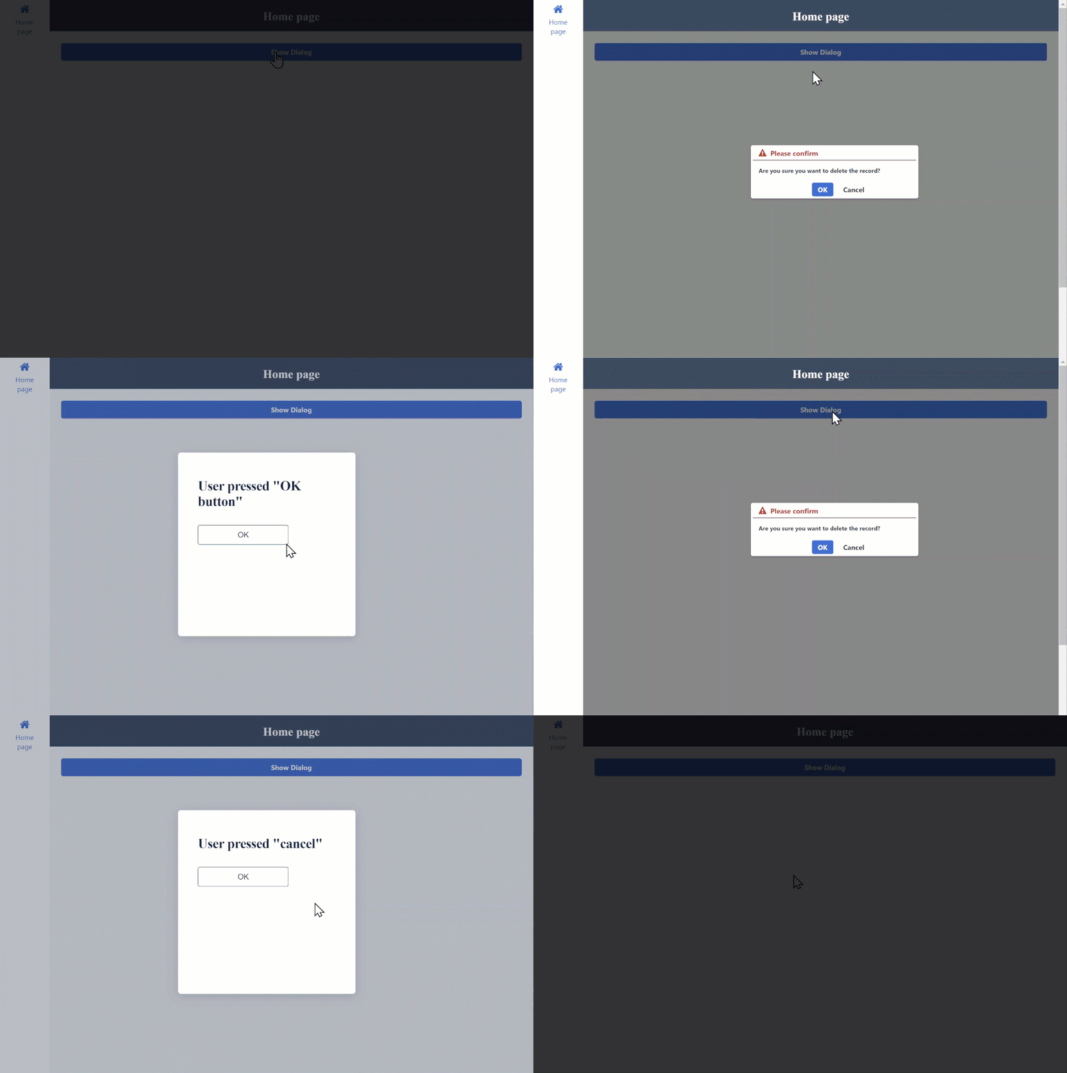
Now it should work like this:
How it was created
This is just a short summary of what was done to create the custom component.
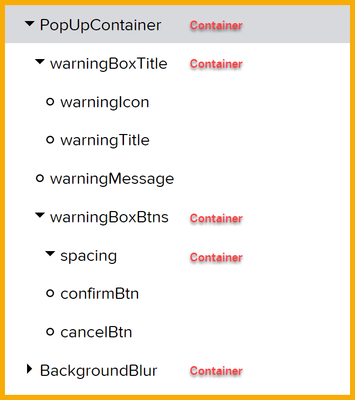
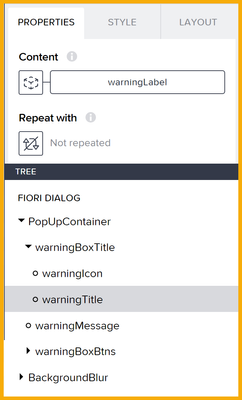
Inside a container, the following components were added, and then the outer container was converted to a component by clicking Convert to New Component in the Properties tab.
The above created the basic dialog box:
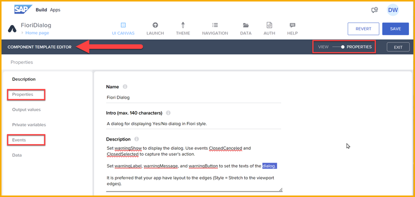
Inside the component template editor, we created the following:
- Properties to let developers set the dialog texts and to enable the dialog
- Events to let developers capture which button the user clicked
In the inner components, the properties were used to set the corresponding property. For example, the label property set the title of the dialog.
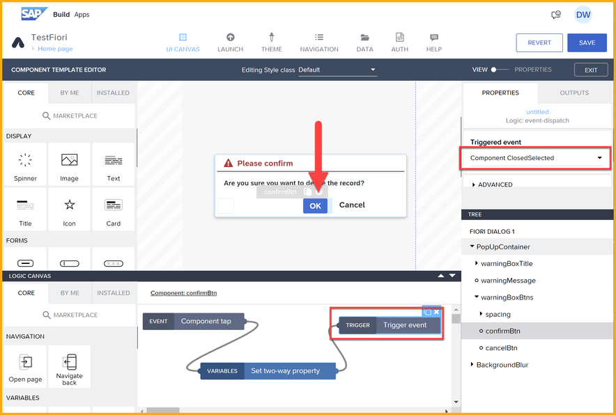
And the events were triggered when a user clicked a button. For example, for the action button, a click sets the property to hide the dialog, and then the ClosedSelected event is triggered, which can be captured in the containing app.
NOTE: Currently there is no way to set certain layout properties on the component itself, so these must done by you, the consumer of the component.
If you want to modify the component
Currently, if you open the component with the component template editor, you will not see the dialog box. To see it, do the following:
- Select the component, and then for the Visibility property, switch Set preview value to true.
- Open the component in the component template editor, select PopUpContainer, and for the Visibility property, switch Set preview value to true.
Ideas for further development
Here are some ideas for enhancements:
- Add a property and output to the component so you can set the property before using the dialog and then check the property when receiving the events.
- Enable the user to customize the icon.
- Enable additional buttons.
- SAP Managed Tags:
- SAP Build,
- SAP Build Apps
You must be a registered user to add a comment. If you've already registered, sign in. Otherwise, register and sign in.
-
1H 2024 Product Release
1 -
Advanced Edition
1 -
Approval Workflows
1 -
Automating Processes
11 -
aws
1 -
BTP
1 -
Building Sites
7 -
Citizen Development
22 -
Contest
1 -
Developing Apps
26 -
Developing with SAP Integration Suite
2 -
Extensibility
1 -
Fusion Teams
3 -
Getting Started
24 -
How I Did It
21 -
Migration
1 -
Pro Development
6 -
Product Updates
2 -
Product Updates
1 -
SAP BTP Innovation
1 -
SAP Build
7 -
SAP Build apps
8 -
SAP Build CodeJam
1 -
SAP Build Process Automation
8 -
SAP Build work zone
7 -
SAP Integration Suite
1 -
SAP S4HANA
1 -
SAP Signavio Process Insights
1 -
SAP Signavio Process Intelligence
1 -
Standard Edition
1
