
- SAP Community
- Products and Technology
- Technology
- Technology Blogs by SAP
- Creating a Fiori OVP Application with CDS view ann...
Technology Blogs by SAP
Learn how to extend and personalize SAP applications. Follow the SAP technology blog for insights into SAP BTP, ABAP, SAP Analytics Cloud, SAP HANA, and more.
Turn on suggestions
Auto-suggest helps you quickly narrow down your search results by suggesting possible matches as you type.
Showing results for
 jamie_cawley
Advisor
Options
- Subscribe to RSS Feed
- Mark as New
- Mark as Read
- Bookmark
- Subscribe
- Printer Friendly Page
- Report Inappropriate Content
07-05-2016
9:09 PM
In this blog we will add some additional OVP Cards to the application we created in the previous two blogs. If you haven't already done so, please review the first two blogs of the series, which can be found at
Creating a Fiori OVP Application with CDS view annotations - Part 1
Creating a Fiori OVP Application with CDS view annotations - Part 2
ADDING A STACK CARD TO THE OVP APPLICATION
The stack card relies on the annotations defined by @UI.headerInfo, @UI.identification and @UI.fieldGroup. Using the headerInfo annotation allows us to define a typeName which will be shown as the card header, as well as a title and header. In addition you can also utilize the annotation @UI.headerInfo.imageUrl to display an image next to the title and description. For the image, I will just hard card a value there, field mytestImg, due to the view not having a image field at this level.
These assignments will be as follows
@UI.headerInfo: {

  typeNamePlural: 'Sales Orders',

imageUrl: 'mytestImg',

  typeName: 'Sales Order',

  title: {

    label: 'Order ID',

    value: 'sales_order_id'

  },

  description: {

    label: 'Customer',

    value: 'company_name'

  }

}

define view Z_Ovp_Demo as select from sepm_cds_sales_order as so {

....

 '/resources/sap/ui/core/mimes/logo/sap_50x26.png' as mytestImg,
The stack card has two clickable areas. The left side of the card, the white can be used to navigate to another app using semantic navigation. Clicking the right side will open up the card view. To assign the left side of the card's navigation point we will utilize the @UI.identification annotation as follows. This will also display within each card with the position identifying the layout.
@UI.identification: {type: #FOR_INTENT_BASED_NAVIGATION, semanticObjectAction: 'toappnavsample2', label: 'Nav Sample', position: '10'}
We can also add another button in each card using the same annotation. For this we can utilize the web_address field as the navigation path.
@UI.identification: {type: #WITH_URL, label: 'Customer Site', url: 'web_address', position: '20'}

so.customer.web_address
Finally, we can define a fieldGroup to display some additional data in each card, but to utilize this we will have to add some additional local annotations in our Web IDE OVP application. We can do this by utilizing the Annotation Modeler of Web IDE, but lets first save and activate the CDS View.
@UI.fieldGroup: {groupLabel: 'Contact Details', label: 'Email', position: '10', qualifier: 'cusContact'}

so.customer.email_address,

@UI.fieldGroup: {groupLabel: 'Contact Details', label: 'Phone', position: '20', qualifier: 'cusContact'}

so.customer.phone_number,
The result of our changes necessary for our stack card should yield
@AbapCatalog.sqlViewName: 'zovpdemo'

@AbapCatalog.compiler.compareFilter: true

@AccessControl.authorizationCheck: #CHECK

@EndUserText.label: 'OVP Demo App'

@OData.publish: true

@UI.headerInfo: {

  typeNamePlural: 'Sales Orders',

imageUrl: 'mytestImg',

  typeName: 'Sales Order',

  title: {

    label: 'Order ID',

    value: 'sales_order_id'

  },

  description: {

    label: 'Customer',

    value: 'company_name'

  }

}

define view Z_Ovp_Demo as select from sepm_cds_sales_order as so {

key so.sales_order_key,

@UI.selectionField: [ { position: 10 } ]

@Consumption.semanticObject: 'Action'

@UI.identification: {type: #FOR_INTENT_BASED_NAVIGATION, semanticObjectAction: 'toappnavsample2', label: 'Nav Sample', position: '10'}

@UI.lineItem:  [{ label: 'salesOrd', qualifier:'ordOverView',type: #FOR_INTENT_BASED_NAVIGATION, semanticObjectAction: 'toappnavsample'},

    { position: 10, qualifier:'ordOverView', label: 'Sales Order'}]

so.sales_order_id,

so.created_by,

so.created_at,

so.changed_by,

so.changed_at,

so.note_guid,

so.currency_code,

so.gross_amount,

@UI.dataPoint: {title: 'Net Amt',

    criticalityCalculation: {

    improvementDirection: #TARGET,

    deviationRangeLowValue: 100,

    toleranceRangeLowValue: 400,

    toleranceRangeHighValue: 800,

    deviationRangeHighValue: 1200

    },

    valueFormat:{

        numberOfFractionalDigits: 1

    }}

@UI.lineItem:  { position: 30, qualifier:'ordOverView', label: 'Net Amount', type: #AS_DATAPOINT}


so.net_amount,

@UI.dataPoint: {title: 'Tax Amt', valueFormat:{

    numberOfFractionalDigits: 1

}}

@UI.lineItem:  { position: 40, qualifier:'ordOverView', label: 'Tax Amount', type: #AS_DATAPOINT}

so.tax_amount,

@UI.dataPoint: {title: 'Lifecycle'}

@UI.lineItem:  { position: 50, qualifier:'ordOverView', label: 'Lifecycle', type: #AS_DATAPOINT}

so.lifecycle_status,

so.billing_status,

so.delivery_status,

so.buyer_guid,

/* Associations */

so.customer,

so.items,

@UI.selectionField: [ { position: 20 } ]

@UI.lineItem:  { position: 20, qualifier:'ordOverView', label: 'Customer',  }

so.customer.company_name,

@UI.fieldGroup: {groupLabel: 'Contact Details', label: 'Email', position: '10', qualifier: 'cusContact'}

so.customer.email_address,

@UI.fieldGroup: {groupLabel: 'Contact Details', label: 'Phone', position: '20', qualifier: 'cusContact'}

so.customer.phone_number,


@UI.identification: {type: #WITH_URL, label: 'Customer Site', url: 'web_address', position: '20'}

so.customer.web_address

 '/resources/sap/ui/core/mimes/logo/sap_50x26.png' as mytestImg,

}
After saving and activating the CDS view changes we can now add the Stack Card to the application. In your OVP Application add a Stack Card as shown
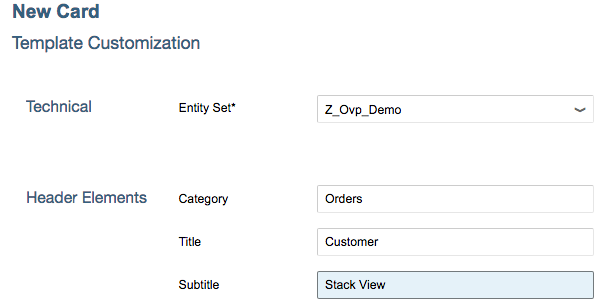
This will yield the card

The card has two clickable areas, the white area and also the blue area. Clicking on the white area relies on the first @UI.identification and clicking on the blue area which opens the cards results in
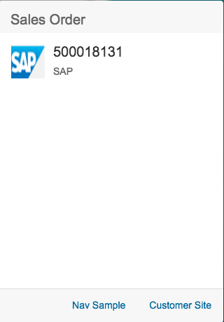
Choosing the Customer Site button will navigate us to the url provided by the field web_address and the Nav Sample button we take us to a predefined navigation sample app.
Adding the Field Group
To utilize the field group, it's necessary to add some additional annotations utilizing the Annotation Modeler. To do this let's first right click on the Web IDE project's webapp folder and choose New -> folder and name it annotations. Now right click on the annotations folder and choose New -> Annotation File and provide the values

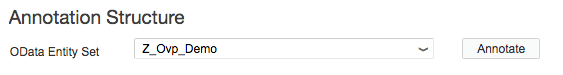
choose Next and Finish to complete the process. In addition to creating the file, this process will add an additional entry in the manifest.json declaring a local annotation. Right click on the new annotation file and choose Open With -> Annotation Modeler. When the editor opens, choose the Annotate button next to the OData Entity Set.
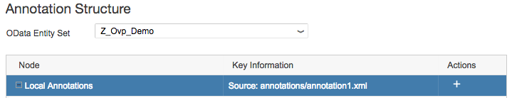
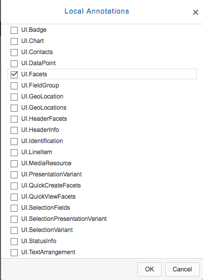
Select the node Local Annotations and then choose the add button under actions.
Choose the annotation UI.Facets and choose OK.
Now with the Facet annotation selected, choose the add button and add a ReferenceFacet to it.
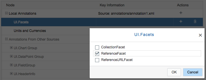
Finally assign the fieldGroup to the ReferenceFacet by setting the Annotation property to the FieldGroup Qualifier cusContact and Save your changes.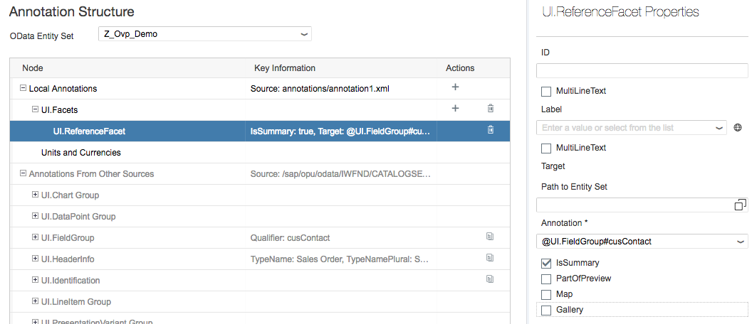
After refreshing your app your stack card should now look like

ADDING A CHART CARD TO THE OVP APPLICATION
OVP applications have the ability to show numerous types of analytical charts. In this example we will add a line chart, but the procedure is the same form any type of chart card. CDS views provide the annotation @UI.chart which contain the majority of the information related to the card. To adjust the displayeddata we can also utilize the annotation @UI.presentationVariant, which allows grouping and sorting or data, and the annotation @UI.selectionVariant, which allows filtering of data. Additionally, the annotation @UI.dataPoint is available to display a KPI value in the card header as well as the annotation @UI.identification to define a navigation path.
In our CDS view lets first define a line chart as follows in the view area.
@UI.chart:[{

    qualifier: 'ordNetChart',

    title:'Order Net Amount',

    chartType: #LINE,

    dimensions: ['sales_order_id'],

    measures: ['net_amount', 'tax_amount'],

    dimensionAttributes: {dimension: 'sales_order_id', role:#SERIES},

    measureAttributes: [{measure: 'net_amount', role: #AXIS_1}, {measure: 'tax_amount', role: #AXIS_1}]

 }]
To limit the amount of data we see in our chart we can utilize the presentation variant annotation which we can use to sort the data in addition to limiting the results returned. This is also a view level annotation so we can add it under our chart.
@UI.presentationVariant: [{qualifier: 'top5Changed', maxItems: '5', sortOrder.by: 'changed_at', sortOrder.direction: #DESC }]n: #DESC }]
For the example we can define a static field myTarget which we used to display in the KPI header area using the @UI.dataPoint annotation.
 @UI.dataPoint:{title: 'Order Target Value', criticalityCalculation: {

        improvementDirection: #MAXIMIZE,

        toleranceRangeLowValue: 8000,

        deviationRangeLowValue: 9000} }

    10000.00 as myTarget,
The resulting CDS view should now be
@AbapCatalog.sqlViewName: 'zovpdemo'

@AbapCatalog.compiler.compareFilter: true

@AccessControl.authorizationCheck: #CHECK

@EndUserText.label: 'OVP Demo App'

@OData.publish: true

@UI.headerInfo: {

  typeNamePlural: 'Sales Orders',

  imageUrl: 'mytestImg',

  typeName: 'Sales Order',

  title: {

    label: 'Order ID',

    value: 'sales_order_id'

  },

  description: {

    label: 'Customer',

    value: 'company_name'

  }

}

@UI.chart:[{

    qualifier: 'ordNetChart',

    title:'Order Net Amount',

    chartType: #LINE,

    dimensions: ['sales_order_id'],

    measures: ['net_amount', 'tax_amount'],

    dimensionAttributes: {dimension: 'sales_order_id', role:#SERIES},

    measureAttributes: [{measure: 'net_amount', role: #AXIS_1}, {measure: 'tax_amount', role: #AXIS_1}]

 }]

@UI.presentationVariant: [{qualifier: 'top5Changed', maxItems: '5',  sortOrder.by: 'changed_at', sortOrder.direction: #DESC }]

define view Z_Ovp_Demo

as select from sepm_cds_sales_order as so

{

key so.sales_order_key,

    @Consumption.semanticObject: 'Action'

    @UI.identification: {type: #FOR_INTENT_BASED_NAVIGATION, semanticObjectAction: 'toappnavsample2', label: 'Nav Sample', position: '10'}

    @UI.lineItem:  [{ label: 'salesOrd', qualifier:'ordOverView',type: #FOR_INTENT_BASED_NAVIGATION, semanticObjectAction: 'toappnavsample'},

      { position: 10, qualifier:'ordOverView', label: 'Sales Order'}]

    @UI.selectionField: [ { position: '10' } ]

    so.sales_order_id,

    so.created_by,

    so.created_at,

    so.changed_by,

    so.changed_at,

    so.note_guid,

    so.currency_code,

    '/resources/sap/ui/core/mimes/logo/sap_50x26.png' as mytestImg,

    @UI.dataPoint:{title: 'For Charts', referencePeriod.end: 'created_at', criticalityCalculation: {

        improvementDirection: #MAXIMIZE,

        toleranceRangeLowValue: 1000,

        deviationRangeLowValue: 4000}}

    so.gross_amount,

    @UI.dataPoint:{title: 'Order Target Value', criticalityCalculation: {

        improvementDirection: #MAXIMIZE,

        toleranceRangeLowValue: 8000,

        deviationRangeLowValue: 9000} }

    10000.00 as myTarget,

    @UI.dataPoint: {title: 'Net Amt',

      criticalityCalculation: {

        improvementDirection: #TARGET,

        deviationRangeLowValue: 100,

        toleranceRangeLowValue: 400,

        toleranceRangeHighValue: 800,

        deviationRangeHighValue: 1200

        },

        valueFormat:{

          numberOfFractionalDigits: 1

        }}

    @UI.lineItem:  [{ position: 30, qualifier:'ordOverView', label: 'Net Amount',  type: #AS_DATAPOINT},{qualifier: 'chartLineItem'}]

    so.net_amount,

    @UI.dataPoint: {title: 'Tax Amt', valueFormat:{

      numberOfFractionalDigits: 1

    }}

    @UI.lineItem:  { position: 40, qualifier:'ordOverView', label: 'Tax Amount', type: #AS_DATAPOINT}

    so.tax_amount,

    @UI.dataPoint: {title: 'Lifecycle'}

    @UI.lineItem:  { position: 50, qualifier:'ordOverView', label: 'Lifecycle', type: #AS_DATAPOINT}

    so.lifecycle_status,

    so.billing_status,

    so.delivery_status,

    so.buyer_guid,

    /* Associations */

    so.customer,

    so.items,

    @UI.lineItem:  { position: 20, qualifier:'ordOverView', label: 'Customer' }

    @UI.selectionField: [ { position: '20' } ]

    @UI.identification: [{label: 'Customer', position: '10'}]

    so.customer.company_name,

    @UI.fieldGroup: {groupLabel: 'Contact Details', label: 'Email', position: '10', qualifier: 'cusContact'}

    so.customer.email_address,

    @UI.fieldGroup: {groupLabel: 'Contact Details', label: 'Phone', position: '20', qualifier: 'cusContact'}

    so.customer.phone_number,

    @UI.identification: {type: #WITH_URL, label: 'Customer Site', url: 'web_address', position: '20'}

    so.customer.web_address

}
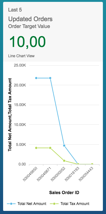
After saving and activating the CDS view add another card to define a Line Chart. Define the card as
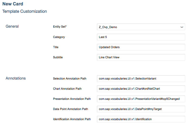
The should result in the card
- SAP Managed Tags:
- SAPUI5,
- SAP Enterprise Portal
37 Comments
You must be a registered user to add a comment. If you've already registered, sign in. Otherwise, register and sign in.
Labels in this area
-
ABAP CDS Views - CDC (Change Data Capture)
2 -
AI
1 -
Analyze Workload Data
1 -
BTP
1 -
Business and IT Integration
2 -
Business application stu
1 -
Business Technology Platform
1 -
Business Trends
1,658 -
Business Trends
94 -
CAP
1 -
cf
1 -
Cloud Foundry
1 -
Confluent
1 -
Customer COE Basics and Fundamentals
1 -
Customer COE Latest and Greatest
3 -
Customer Data Browser app
1 -
Data Analysis Tool
1 -
data migration
1 -
data transfer
1 -
Datasphere
2 -
Event Information
1,400 -
Event Information
67 -
Expert
1 -
Expert Insights
177 -
Expert Insights
306 -
General
1 -
Google cloud
1 -
Google Next'24
1 -
GraphQL
1 -
Kafka
1 -
Life at SAP
780 -
Life at SAP
13 -
Migrate your Data App
1 -
MTA
1 -
Network Performance Analysis
1 -
NodeJS
1 -
PDF
1 -
POC
1 -
Product Updates
4,576 -
Product Updates
349 -
Replication Flow
1 -
REST API
1 -
RisewithSAP
1 -
SAP BTP
1 -
SAP BTP Cloud Foundry
1 -
SAP Cloud ALM
1 -
SAP Cloud Application Programming Model
1 -
SAP Datasphere
2 -
SAP S4HANA Cloud
1 -
SAP S4HANA Migration Cockpit
1 -
Technology Updates
6,873 -
Technology Updates
434 -
Workload Fluctuations
1
Related Content
- SAP Datasphere + SAP S/4HANA: Your Guide to Seamless Data Integration in Technology Blogs by SAP
- Sapphire 2024 user experience and application development sessions in Technology Blogs by SAP
- Deployment of Seamless M4T v2 models on SAP AI Core in Technology Blogs by SAP
- SAP Fiori for SAP S/4HANA - Empowering Your Homepage: Enabling My Home for SAP S/4HANA 2023 FPS01 in Technology Blogs by SAP
- How-to-guide for SAP GUI Scripting in Technology Q&A
Top kudoed authors
| User | Count |
|---|---|
| 24 | |
| 19 | |
| 12 | |
| 10 | |
| 9 | |
| 9 | |
| 8 | |
| 8 | |
| 7 | |
| 7 |