
- SAP Community
- Products and Technology
- Technology
- Technology Blogs by SAP
- Debrief a model from a Jupyter notebook using the ...
Technology Blogs by SAP
Learn how to extend and personalize SAP applications. Follow the SAP technology blog for insights into SAP BTP, ABAP, SAP Analytics Cloud, SAP HANA, and more.
Turn on suggestions
Auto-suggest helps you quickly narrow down your search results by suggesting possible matches as you type.
Showing results for
Advisor
Options
- Subscribe to RSS Feed
- Mark as New
- Mark as Read
- Bookmark
- Subscribe
- Printer Friendly Page
- Report Inappropriate Content
02-20-2018
4:00 PM
In a previous article, we saw how to train and save a classification model from a Jupyter notebook using the Python API of SAP Predictive Analytics. The next logical step in predictive modeling is, for the user, to look at the model performance indicators, visualize the ROC curve, discover which predictors contribute the most, check the correlated variables, analyze binned variables. How to achieve that with the Python API will be the focus of this post.
All the following snippets work the same whether your model was built from a notebook or from the SAP Predictive Analytics desktop application.
Initialization
We open a brand new Jupyter notebook and run the below code prior working with our model. You may need to adjust the three paths provided at the beginning so that they correspond to your own installation directories.
Loading the Predictive Model
Let’s retrieve the model we have saved previously.
We specify the location of the model, its name, and we open a store.
The method described below allows us to get the latest version of the model.

We load the model.
A First Look at the Model
We display the general properties of the predictive model.

We are not sure what the name of the target for this model is. Let’s find out.
Note that a model can have several targets. In the present case, our model has only one target. In the following code, the value of the target name is assigned to the Python variable: target_col.
Because our target is made of two classes, we can show the proportion of positive and negative cases.

We check how the data was split for learning and validation purposes.

An important information about a trained model is its performance indicators.

The predictive power (accuracy) of our model is 80.97%. This indicator gives the percentage of information in the target that can be explained by the predictors. The prediction confidence is 99.62%. This second indicator evaluates the capacity of the model to reproduce the same accuracy when applied to a new dataset exhibiting the same characteristics as the training dataset. A model with a prediction confidence value of 95% or above is considered robust.
Contribution of Predictors
After seeing the overall model performance, often the user wants to know how much each predictor contributes to the target outcome. The contribution can be presented in a table.
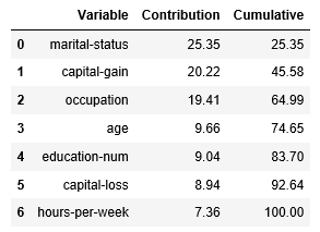
7 variables out of 14 were kept by the auto-selection process.
We plot the contributions in a bar chart.

Performance Curve
We draw a ROC curve to visualize the performance of the classifier.

The green curve represents the hypothetical perfect model, the blue curve represents our model, and the red line represents a random guess.
More information about the ROC curve can be found here.
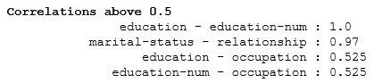
Correlation between Predictors
At training time, Automated Analytics evaluates the correlation strength between candidate predictors. Only correlations with a coefficient above the model threshold are kept. This threshold is set, by default, to 0.5 in absolute value.
Statistics on Binned Variables
Automated Analytics takes in charge various data pre-processing operations like encoding and binning. The trained model stores summary statistics computed for each predictor by bin (aka category). One can list all the categories of a given predictor with their statistics.
We choose a continuous variable: capital gain.

After generating categories, Automated Analytics generates groups which are in fact compressed categories. These groups appear in the final scoring equation. The table we have just built for categories can also be done for groups.
Binned Variable Distribution for each Class
In this last section, we show how to list categories with their positive and negative cases.
We choose a categorical variable: occupation.

We plot two bar charts to visually compare the distribution.

An equivalent analysis can be done by group.

Again, two separate charts for visual comparison.

In a next post, we will explain how you can export the scoring equation of a trained model.
All the following snippets work the same whether your model was built from a notebook or from the SAP Predictive Analytics desktop application.
Initialization
We open a brand new Jupyter notebook and run the below code prior working with our model. You may need to adjust the three paths provided at the beginning so that they correspond to your own installation directories.
import sys

sys.path.append(r"C:\Program Files\SAP Predictive Analytics\Desktop\Automated\EXE\Clients\Python35")

import os

os.environ['PATH'] = r"C:\Program Files\SAP Predictive Analytics\Desktop\Automated\EXE\Clients\CPP"


AA_DIRECTORY = "C:\Program Files\SAP Predictive Analytics\Desktop\Automated"


import aalib


class DefaultContext(aalib.IKxenContext):

    def __init__(self):

        super().__init__()


    def userMessage(self, iSource, iMessage, iLevel):

        print(iMessage)

        return True


    def userConfirm(self, iSource, iPrompt):

        pass


    def userAskOne(iSource, iPrompt, iHidden):

        pass


    def stopCallBack(iSource):

        pass


frontend = aalib.KxFrontEnd([])

factory = frontend.getFactory()

context = DefaultContext()


factory.setConfiguration("DefaultMessages", "true")

config_store = factory.createStore("Kxen.FileStore")

config_store.setContext(context, 'en', 10, False)

config_store.openStore(AA_DIRECTORY + "\EXE\Clients\CPP", "", "")

config_store.loadAdditionnalConfig("KxShell.cfg")
Loading the Predictive Model
Let’s retrieve the model we have saved previously.
We specify the location of the model, its name, and we open a store.
folder_name = r"O:\MODULES_PA/PYTHON_API/MY_MODELS"

model_name = "My Classification Model"

store = factory.createStore("Kxen.FileStore")

store.openStore(folder_name, "", "")
The method described below allows us to get the latest version of the model.
help(store.restoreLastModelD)
We load the model.
model = store.restoreLastModelD(model_name)
A First Look at the Model
We display the general properties of the predictive model.
model.getParameter("")


my_list = ["ModelName", "BuildDate", "BuildData", "ClassName/Default"]

for i in my_list:

  d_object = model.getParameter("Infos/" + i)

  d_value =  d_object.getNameValue().value

  print("{}: {}".format(i, d_value))
We are not sure what the name of the target for this model is. Let’s find out.
Note that a model can have several targets. In the present case, our model has only one target. In the following code, the value of the target name is assigned to the Python variable: target_col.
d_path = "Protocols/Default/Transforms/Kxen.RobustRegression/Results"

d_param = model.getParameter(d_path)

d_values = d_param.getSubEntries([""])

target_idx = 0

target_col = d_values[target_idx][0]
Because our target is made of two classes, we can show the proportion of positive and negative cases.
partition = 'Estimation'

d_path = "Protocols/Default/Variables/%s/Statistics/%s/Categories" % (target_col, partition)

d_param = model.getParameter(d_path)

d_values = d_param.getSubEntries(["", "Weight", "Frequency"])

v_sorted = sorted(d_values, key=lambda x: float(x[2]), reverse=True)


text= "Observations within the %s partition" % (partition)

print('\x1b[1m'+ text + '\x1b[0m')

xs0 = [x[0] for x in v_sorted]

xs2 = [int(x[2]) for x in v_sorted]

xs3 = [float(x[3]) * 100 for x in v_sorted]

for x0, x2, x3 in zip(xs0, xs2, xs3):

    print("{} = {} ; {:0} rows ({:0.2f}%)".format(target_col, x0, x2, x3))
We check how the data was split for learning and validation purposes.
d_path = ("Protocols/Default/Variables/%s/Statistics") % target_col

d_param = model.getParameter(d_path)

d_values = d_param.getSubEntries(["", "WeightTotal"])


import pandas as pd

df = pd.DataFrame(list(d_values), columns=["Partition", "Type", "Observations"])


df.drop("Type", axis=1, inplace=True)

df['Observations'] = df['Observations'].astype(int)

df['In %'] = (df['Observations'] / df['Observations'].sum()).round(4)*100

df
An important information about a trained model is its performance indicators.
indicator = 'Ki'

d_path = "Protocols/Default/Variables/rr_%s/Statistics/Validation/Targets/%s/%s" % (target_col, target_col, indicator)

d_object = model.getParameter(d_path)

d_value =  float(d_object.getNameValue().value) * 100

print("Predictive Power (KI) is {:0.2f}%".format(d_value))

indicator = 'Kr'

d_path = "Protocols/Default/Variables/rr_%s/Statistics/Estimation/Targets/%s/%s" % (target_col, target_col, indicator)

d_object = model.getParameter(d_path)

d_value =  float(d_object.getNameValue().value) * 100

print("Prediction Confidence (KR) is {:0.2f}%".format(d_value))
The predictive power (accuracy) of our model is 80.97%. This indicator gives the percentage of information in the target that can be explained by the predictors. The prediction confidence is 99.62%. This second indicator evaluates the capacity of the model to reproduce the same accuracy when applied to a new dataset exhibiting the same characteristics as the training dataset. A model with a prediction confidence value of 95% or above is considered robust.
Contribution of Predictors
After seeing the overall model performance, often the user wants to know how much each predictor contributes to the target outcome. The contribution can be presented in a table.
d_path = ("Protocols/Default/Transforms/Kxen.RobustRegression/Results/%s/MaxCoefficients" % target_col)

d_param = model.getParameter(d_path)

d_values = d_param.getSubEntries(("Contrib"))

v_sorted = sorted(d_values, key=lambda x: float(x[1]), reverse=True)


df = pd.DataFrame(v_sorted, columns=["Variable", "Contribution"])

df['Contribution'] = df['Contribution'].astype(float)

df['Cumulative'] = df['Contribution'].cumsum()

df['Contribution'] = df['Contribution'].round(4)*100

df['Cumulative'] = df['Cumulative'].round(4)*100

non_zero = df['Contribution'] != 0

dfs = df[non_zero].sort_values(by=['Contribution'], ascending=False)

dfs
7 variables out of 14 were kept by the auto-selection process.
We plot the contributions in a bar chart.
import matplotlib.pyplot as plt

c_title = "Contributions to %s" % target_col

dfs = dfs.sort_values(by=['Contribution'], ascending=True)

dfs.plot(kind='barh', x='Variable', y='Contribution', title=c_title, legend=False, fontsize=12)

plt.show()
Performance Curve
We draw a ROC curve to visualize the performance of the classifier.
def plot_profit_curve(model,

                      variable_name,

                      curve_type,

                      target_variable = "",

                      target_key_variable = "",

                      num_points = 20,

                      data_set = "",

                      based_on_frequency = True,

                      use_weight = True,

                      use_groups = True):


    proto = model.getProtocolFromName("Default")

    curve = proto.getProfitCurve2(variable_name, target_variable,

                                  target_key_variable, num_points,

                                  curve_type, data_set, based_on_frequency,

                                  use_weight, use_groups)

    pd_curve = pd.DataFrame(list(curve[1:]), columns = curve[0])


    fig = plt.figure(figsize = (14,8))

    fig.gca().set_facecolor('none')

    fig.gca().spines['left'].set_facecolor('grey')

    fig.gca().spines['bottom'].set_facecolor('grey')

    fig.gca().spines['top'].set_facecolor('none')

    fig.gca().spines['right'].set_facecolor('none')


    mygreen = '#00ff00'

    plt.fill_between(pd_curve['Frequency'], pd_curve['Random'], pd_curve['Wizard'], color=mygreen, alpha = 0.1)

    plt.fill_between(pd_curve['Frequency'], pd_curve['Random'], pd_curve['Validation'], color="blue", alpha = 0.1)


    pl_rnd, = plt.plot(pd_curve['Frequency'], pd_curve['Random'], color='red', label='Random', lw=1)

    pl_wiz, = plt.plot(pd_curve['Frequency'], pd_curve['Wizard'], color=mygreen, label='Wizard', lw=1)

    pl_est, = plt.plot(pd_curve['Frequency'], pd_curve['Validation'], color='blue', label='Model', lw=1)


    plt.grid(color='b', alpha=0.9, linestyle='dashed', linewidth=0.2)

    plt.xlabel('False Positive Rate', fontsize=14)

    plt.ylabel('True Positive Rate',  fontsize=14)

    plt.title('ROC Curve for ' + variable_name.lstrip('rr_'), fontsize=16, fontweight='bold')

    plt.xticks(pd_curve['Frequency'], pd_curve['Frequency'], rotation=30, fontsize=12)

    plt.legend(handles=[pl_rnd, pl_wiz, pl_est], loc=4, fontsize=16)

    plt.show()


plot_profit_curve(model, variable_name="rr_" + target_col, curve_type=aalib.Kxen_roc)
The green curve represents the hypothetical perfect model, the blue curve represents our model, and the red line represents a random guess.
More information about the ROC curve can be found here.
Correlation between Predictors
At training time, Automated Analytics evaluates the correlation strength between candidate predictors. Only correlations with a coefficient above the model threshold are kept. This threshold is set, by default, to 0.5 in absolute value.
# Read Threshold Value

d_path = ("Protocols/Default/Transforms/Kxen.RobustRegression/Parameters/LowerBound")

d_param = model.getParameter(d_path)

d_value = float(d_param.getNameValue().value)

# Get Pairs with Coefficient

d_path = ("Protocols/Default/Transforms/Kxen.RobustRegression/Results/%s/Correlations" % target_col)

d_param = model.getParameter(d_path)

d_values = d_param.getSubEntries(["", "Var1", "Var2"])

v_sorted = sorted(d_values, key=lambda x: float(x[1]), reverse=True)

# Print Pairs

text= "Correlations above %s" % (d_value)

print('\x1b[1m'+ text + '\x1b[0m')

xs1 = [round(float(x[1]),3) for x in v_sorted]

xs2 = [x[2] for x in v_sorted]

xs3 = [x[3] for x in v_sorted]

for x1, x2, x3 in zip(xs1, xs2, xs3):

    print("{:>40} : {:0.3}".format(x2 + ' - ' + x3, x1))
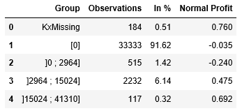
Statistics on Binned Variables
Automated Analytics takes in charge various data pre-processing operations like encoding and binning. The trained model stores summary statistics computed for each predictor by bin (aka category). One can list all the categories of a given predictor with their statistics.
We choose a continuous variable: capital gain.
partition = 'Estimation'

predictor = 'capital-gain'


d_path = ("Protocols/Default/Variables/%s/Statistics/%s/Categories") % (predictor, partition)

d_param = model.getParameter(d_path)

d_path = ("Targets/%s/NormalProfit") % target_col

d_values = d_param.getSubEntries(["", "Weight", "Frequency", d_path])


df = pd.DataFrame(list(d_values), columns=["Category", "Type", "Observations", "In %", "Normal Profit"])

df.drop("Type", axis=1, inplace=True)

df['Observations'] = df['Observations'].astype(int)

df['In %'] = df['In %'].astype(float).round(4)*100

df['Normal Profit'] = df['Normal Profit'].astype(float).round(3)

df
After generating categories, Automated Analytics generates groups which are in fact compressed categories. These groups appear in the final scoring equation. The table we have just built for categories can also be done for groups.
d_path = ("Protocols/Default/Variables/%s/Statistics/%s/Targets/%s/Groups") % (predictor, partition, target_col)

d_param = model.getParameter(d_path)

d_path = ("Targets/%s/NormalProfit") % target_col

d_values = d_param.getSubEntries(["", "Weight", "Frequency", d_path])


df = pd.DataFrame(list(d_values), columns=["Group", "Type", "Observations", "In %", "Normal Profit"])

df.drop("Type", axis=1, inplace=True)

df['Observations'] = df['Observations'].astype(int)

df['In %'] = df['In %'].astype(float).round(4)*100

df['Normal Profit'] = df['Normal Profit'].astype(float).round(3)

df
Binned Variable Distribution for each Class
In this last section, we show how to list categories with their positive and negative cases.
We choose a categorical variable: occupation.
predictor = 'occupation'


d_path = "Protocols/Default/Variables/%s/Statistics/%s/Categories" % (target_col, partition)

d_param = model.getParameter(d_path)

d_values = d_param.getSubEntries(["", "Code"])

target_v1 = d_values[0][0]

target_v2 = d_values[1][0]


d_path = ("Protocols/Default/Variables/%s/Statistics/%s/Categories") % (predictor, partition)

d_param = model.getParameter(d_path)

d_path  = ("Targets/%s/TargetCategories/%s/Weight") % (target_col, target_v1)

d_path2 = ("Targets/%s/TargetCategories/%s/Weight") % (target_col, target_v2)

d_values = d_param.getSubEntries(["", d_path, d_path2])


df = pd.DataFrame(list(d_values), columns=["Category", "Type", target_v1, target_v2])

df.drop("Type", axis=1, inplace=True)

df[target_v1] = df[target_v1].astype(int)

df[target_v2] = df[target_v2].astype(int)

df['Total'] = df[target_v1] + df[target_v2]

df[target_v1 + ' (in %)'] = (df[target_v1] / df['Total']).round(4)*100

df[target_v2 + ' (in %)'] = (df[target_v2] / df['Total']).round(4)*100

df
We plot two bar charts to visually compare the distribution.
text= "Observations by Category for %s" % (predictor)

print('\x1b[31;1m'+ text + '\x1b[0m')

c_title = "%s = %s" % (target_col, target_v1)

df.plot(kind='barh', x='Category', y=target_v1, title=c_title,

  alpha=0.6, width=1.0, edgecolor='grey', legend=False, fontsize=12)

c_title = "%s = %s" % (target_col, target_v2)

df.plot(kind='barh', x='Category', y=target_v2, title=c_title,

  alpha=0.6, width=1.0, edgecolor='grey', legend=False, fontsize=12)

plt.show()
An equivalent analysis can be done by group.
d_path = ("Protocols/Default/Variables/%s/Statistics/%s/Targets/%s/Groups") % (predictor, partition, target_col)

d_param = model.getParameter(d_path)

d_path  = ("Targets/%s/TargetCategories/%s/Weight") % (target_col, target_v1)

d_path2 = ("Targets/%s/TargetCategories/%s/Weight") % (target_col, target_v2)

d_values = d_param.getSubEntries(["", d_path, d_path2])


df = pd.DataFrame(list(d_values), columns=["Group", "Type", target_v1, target_v2])

df.drop("Type", axis=1, inplace=True)

df[target_v1] = df[target_v1].astype(int)

df[target_v2] = df[target_v2].astype(int)

df['Total'] = df[target_v1] + df[target_v2]

df[target_v1 + ' (in %)'] = (df[target_v1] / df['Total']).round(4)*100

df[target_v2 + ' (in %)'] = (df[target_v2] / df['Total']).round(4)*100

df
Again, two separate charts for visual comparison.
text= "Observations by Group for %s" % (predictor)

print('\x1b[31;1m'+ text + '\x1b[0m')

c_title = "%s = %s" % (target_col, target_v1)

df.plot(kind='barh', x='Group', y=target_v1, title=c_title,

  alpha=0.6, width=1.0, edgecolor='grey', legend=False, fontsize=12)

c_title = "%s = %s" % (target_col, target_v2)

df.plot(kind='barh', x='Group', y=target_v2, title=c_title,

  alpha=0.6, width=1.0, edgecolor='grey', legend=False, fontsize=12)

plt.show()
In a next post, we will explain how you can export the scoring equation of a trained model.
- SAP Managed Tags:
- Machine Learning,
- SAP Predictive Analytics
2 Comments
You must be a registered user to add a comment. If you've already registered, sign in. Otherwise, register and sign in.
Labels in this area
-
ABAP CDS Views - CDC (Change Data Capture)
2 -
AI
1 -
Analyze Workload Data
1 -
BTP
1 -
Business and IT Integration
2 -
Business application stu
1 -
Business Technology Platform
1 -
Business Trends
1,658 -
Business Trends
109 -
CAP
1 -
cf
1 -
Cloud Foundry
1 -
Confluent
1 -
Customer COE Basics and Fundamentals
1 -
Customer COE Latest and Greatest
3 -
Customer Data Browser app
1 -
Data Analysis Tool
1 -
data migration
1 -
data transfer
1 -
Datasphere
2 -
Event Information
1,400 -
Event Information
74 -
Expert
1 -
Expert Insights
177 -
Expert Insights
346 -
General
1 -
Google cloud
1 -
Google Next'24
1 -
GraphQL
1 -
Kafka
1 -
Life at SAP
780 -
Life at SAP
14 -
Migrate your Data App
1 -
MTA
1 -
Network Performance Analysis
1 -
NodeJS
1 -
PDF
1 -
POC
1 -
Product Updates
4,575 -
Product Updates
388 -
Replication Flow
1 -
REST API
1 -
RisewithSAP
1 -
SAP BTP
1 -
SAP BTP Cloud Foundry
1 -
SAP Cloud ALM
1 -
SAP Cloud Application Programming Model
1 -
SAP Datasphere
2 -
SAP S4HANA Cloud
1 -
SAP S4HANA Migration Cockpit
1 -
Technology Updates
6,871 -
Technology Updates
479 -
Workload Fluctuations
1
Related Content
- Exploring ML Explainability in SAP HANA PAL – Classification and Regression in Technology Blogs by SAP
- 入門!SAP Analytics Cloud for planning 機能紹介シリーズ - コメント入力 in Technology Blogs by SAP
- SAP Datasphere catalog - Harvesting from SAP Datasphere, SAP BW bridge in Technology Blogs by SAP
- What’s New in SAP Analytics Cloud Q2 2024 in Technology Blogs by SAP
- Understanding Data Modeling Tools in SAP in Technology Blogs by SAP
Top kudoed authors
| User | Count |
|---|---|
| 17 | |
| 15 | |
| 11 | |
| 11 | |
| 9 | |
| 8 | |
| 8 | |
| 7 | |
| 7 | |
| 7 |