
The SAP Fiori design guidelines for web applications have been updated to version 1.84. Here’s a selection of the topics we’ve updated with this edition.
Visual design
Check out the
updated resource links for icons and the new semantic color for information text in the
Quartz Light and
Quartz Dark themes.
UI patterns
In the first of a series of updates, we’ve simplified the overview topic on
creating, editing, and deleting objects. Learn about the difference between simple and complex objects, and which interaction flows to use for each.
The topic on
formatting numbers has also been reworked and now includes more examples.
SAP Fiori floorplans
See where to set the initial focus for key floorplans (
analytical list page,
list report,
overview page,
wizard,
worklist).
UI elements
As we continue to enhance the guidelines for smart controls, we’ve fully revised the
smart link topic.
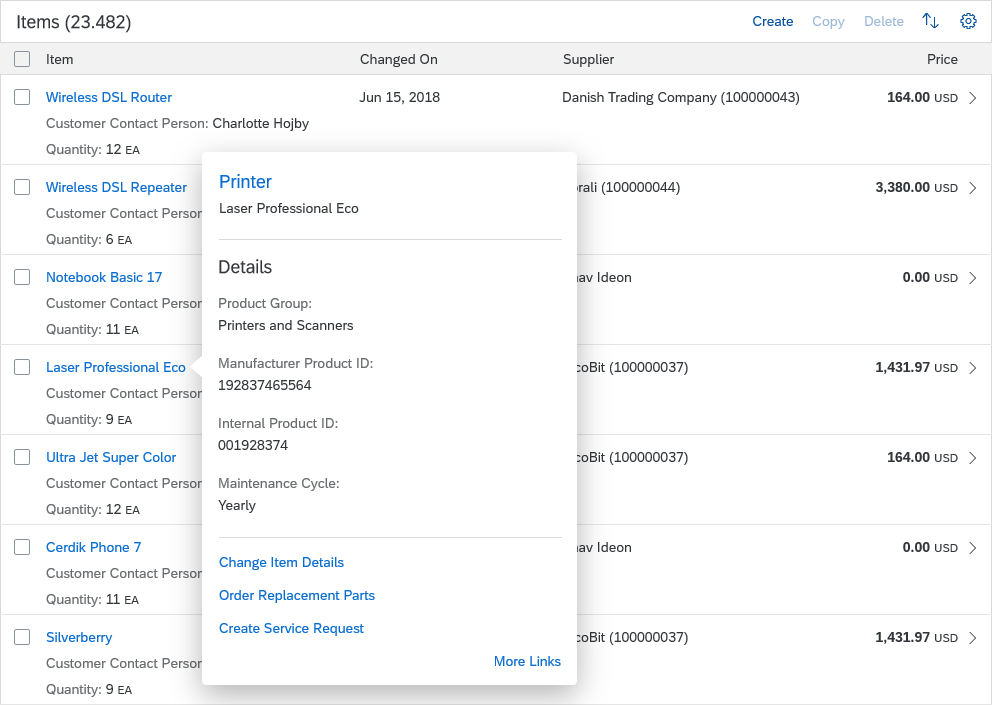 Smart link popover
SAP Fiori design stencils
Guideline version 1.84 contains new stencils for the message page, tiles, calculation builder, and upload controls, along with numerous updates. You can see what’s been added and changed below:
We’re constantly expanding our stencil library, so be sure to check for the latest download before you start working on a new app design.
Other updates
For a complete overview of all changes, see the
What’s New page for version 1.84.
Looking ahead to 2021
The next update to SAP Fiori design guidelines is planned for the beginning of March 2021.
From next year, SAP Community will be our primary channel for communicating updates to the design guidelines. Just follow the
SAP Fiori blog posts to stay up-to-date.
The guidelines themselves will stay at
experience.sap.com/fiori-design/.
This post originally appeared on SAP User Experience Community.
