
- SAP Community
- Products and Technology
- Technology
- Technology Blogs by Members
- UI5 and WebComponents working together
Technology Blogs by Members
Explore a vibrant mix of technical expertise, industry insights, and tech buzz in member blogs covering SAP products, technology, and events. Get in the mix!
Turn on suggestions
Auto-suggest helps you quickly narrow down your search results by suggesting possible matches as you type.
Showing results for
Abagat0
Discoverer
Options
- Subscribe to RSS Feed
- Mark as New
- Mark as Read
- Bookmark
- Subscribe
- Printer Friendly Page
- Report Inappropriate Content
01-16-2019
5:56 AM
Intro
During last OpenUI5 conference, SAP confirmed that they are moving from MVC model to component infrastructure. One of the idea was to use WebComponents/Custom Elements and React Components. It's HTML5 standard for defining new HTML elements. I had to chance know it better in 2014, when I played with polyfils. It was quite different from what ruled on the market. In those days I used a lot JQuery and Angular 1.x with its magical binding, but unfortunately problematic performance. In this time Angular directives gave us possibility for some encapsulation, similar to WebComponents. WebComponents standard, to use capsulated/modularized DOM in shadow/light DOM (at beginning worked only in Chrome), was different but it was very needed for developing big front end applications.
One of the first frameworks that used Custom Elements was Polymer. In 2015, I introduced it with WebComponents on one of the open source conference, as our development future.
Now Custom Elements are the part of the Angular, Polymer, React, Vue, Lit Element, and many more.
All documentation can be find here:
https://developers.google.com/web/fundamentals/web-components/
https://developer.mozilla.org/en-US/docs/Web/Web_Components/Using_custom_elements
https://developer.mozilla.org/en-US/docs/Web/Guide/Events/Creating_and_triggering_events
UI5
For first time I wrote something in UI5 in 2015, when everything was in JS. In Angular or Polymer everything was way more natural (even if abstract) and more modern then in UI5. Frameworks had about 200-500 kb when UI5 had 1,5 mb. When people had limited network, it was a problem. Then SAP improve framework to use Component.js. SAP started to add async loaders to framework parts. XML views/fragments become very popular. I liked this solution, but still there wasn't possibility write something reusal, in proper way. There was problem with global scope. I wanted to write more then view/controller. I tried to create own libs in my projects. From quite some time framework had a lot of improvements and its going in the really good direction. We can write reusable components that helps to have less code with more smarter solutions. During last few years I've seen a lot of positive changes. UI5 can be different at beginning, but when you understand what is behind, how the core is really working, a lot of things becomes clear.
From front end side I had chance to work also with Angular, Polymer, React, JQuery. That's why I'm mixing different solutions, from different frameworks.
Table of Contents:
1. Component introduction - React High Order Component
2. Registering component as custom element
3. Connection between Custom Element and UI5 component
4. Updating Properties and Attributes
5. Component directory architecture - finally we have .component.xml with component content
6. Lifecycle methods from both UI5 and Custom Element
7. Attributes Observables
8. Shadow DOM and light DOM with UI5 WebComponent
9. No more !important - override css sap classes in shadow DOM
10. Slots and templates
11. "slotschange" event handler
12. Creating Custom Events, SAP EventBus, Component Events
13. And finally how to test - QUnit and OPA5 tests
14. To be continue - roadmap with this project
15. Project updates
Link to repository:
https://github.com/abagat0/UI5WebComponent
How it works:
1. Component introduction - React High Order Component
I based on React High Order Components (more info here https://reactjs.org/docs/higher-order-components.html) . It's feature ,where I'm creating higher component, that manage other component, by changing behavior, depends of data/state that was send . In the past in React there was feature called mixin. Due to poor performance it was replaced by high order components.
This is React High Order Component implementation
// This function takes a component...

function withSubscription(WrappedComponent, selectData) {

  // ...and returns another component...

  return class extends React.Component {

    constructor(props) {

      super(props);

      this.handleChange = this.handleChange.bind(this);

      this.state = {

        data: selectData(DataSource, props)

      };

    }

    render() {

      // ... and renders the wrapped component with the fresh data!

      // Notice that we pass through any additional props

      return <WrappedComponent data={this.state.data} {...this.props} />;

    }

  };

}
Bellow my UI5 Component.ts. Last lines of render method are calling custom element instance and passing attributes with data ( similar to react in render function). I'm passing attributes separately to have observables for changes and simpler update. Only attributes that are declared in TestComponent class (in this case pro and message) will be attach to Custom Element. Additionally I'm passing componentId that join custom element instance with ui5 component.
export default class TestComponent extends UIWebComponent {
public static metadata: any = {
manifest:"json",
properties :{
pro : {type : "string", defaultValue : "{/message}", bindable: true},
message : {type : "string", defaultValue : "{/message}", bindable: true}
}
};
public init(): void {
super.init.apply(this, arguments);
this.setModel(new JSONModel({message: "start message"}))
}
public render(oRenderManager: RenderManager):void {
// convenience variable
const oRM = oRenderManager;
const oComponent = this;
oRM.write("<div ");
oRM.write(oComponent.getId())
oRM.writeClasses();
oRM.write("><");
// call custom element tag
oRM.write(oComponent.getProperty("htmlTag"));
// change propeties to attributes
oComponent.writeProperties(oRM)
// pass componentId, it's very important, without this
//custom element and component cannot find/update each other
oRM.writeAttribute("componentId",oComponent.getId())
// pass resolver to begining template (if it was sth declared),
//if there were slots then call slot=' slot name ' to navigate browser where place it
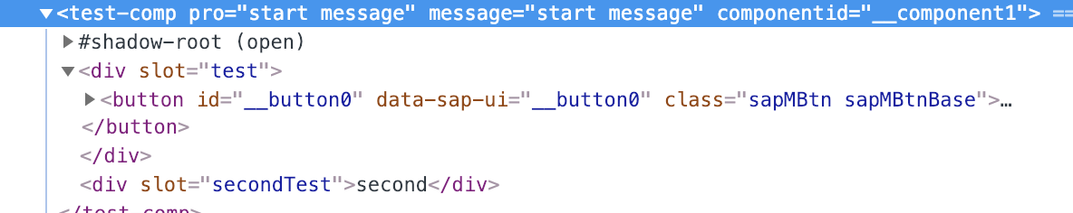
oRM.write("><div slot='test' >"+
oRM.getHTML(oComponent.oContent)+
"</div><div slot='secondTest'>second</div></"+
// close custom element tag
oComponent.getProperty("htmlTag")+
"></div></div>");
};
}Bellow alternatives in different frameworks:
| SAPUI5 | AnguarJs | ReactJS | WebComponents | Polymer |
| MixInto, Interfaces | Mixins: | High order components: | Mixins | Mixins |
In my solution there are two classes. One is Test Component that is extending UIWebComponent, second is UI5CustomElement. When UI5 render component container, passing all settings that are needed to Custom Element, to behave in demanded way. "Higer Component" is from UI5. It's managing of Custom Element. The main logic (extra properties, press handlers etc..) is written in Component.ts(Test Component).
2. Registering Custom Element in the browser
I added link to WebComponents in index.html page.
<script type="text/javascript" src="node_modules/@webcomponents/custom-elements/src/native-shim.js"></script>If we want to support IE we have to add also links to shady DOM (see Browser Support and shadow DOM doc ).
UIWebcomponent class is responsible for creating Custom HTML Element. Webcomponent class can be defined in browser only once.
        // define custom element in browser

        try {

            customElements.define(customElTag, UI5CustomElement);

        } catch {

        }
3. Connection between Custom Element and UI5 Component
My Idea was to have strong connection between component and its Custom Element implementation. Both parties talk with each other. That's helping with components updates. I joined them by componentId that I'm passing as the attribute.:
- Component.ts knows which Custom Element is its html instance, because it is set in the whenDefined promise resolver, and saved to customElement property
customElements.whenDefined(customElTag).then(() => {

            let allInstances: Array<HTMLElement> = Array.from(document.querySelectorAll(customElTag));

            allInstances.map((item: HTMLElement) => {

                if (item.getAttribute("componentId") === this.getId()) {

                    this.customElement = item;

                }

            })

});- UI5CustomElement knows which Component.ts is its logic, because it's receiving component id in the attributes. It's calling UI5 in constructor for component instance and save it own context property
 constructor() {

     this.context = sap.ui.getCore().getComponent(this.getAttribute("componentId"));

}
4. Updating Properties and Attributes
Component.ts properties setters are not only updating component props, but they are also updating attributes in Custom Element. SAP allows to override getters and setters (see more). That mean's when property in model changed ( binding was attached to the property), or we're changing property, all it is automatically reflected to Custom Element with method setAttribute:
   public setMessage(message:string):object{

        this.setProperty("message", message);

        this.setAttribute("message", message)

        return this;

    }
Here is the list of the properties:
Property pro and message are declared in Component.ts class. Rest is coming from UIWebComponent:
- observedAttributes -attribute that changes are observed. We have to be careful to not observe all if is not needed. Each one create own events and has impact to performance.
- shadowDom - if I want to render comp in shadow DOM, then I have to declare this property with type of the shadow DOM (open/closed). If is not declared it will be rendered in the light DOM
- cssUrl - url to custom component css. This is helping with modularization of the css.
- xmlTemplate - sap name for fragment with extension .component.xml. This will be rendered when custom element is called on html.
- htmlTag - name of the html tag that will be representing custom element
<core:ComponentContainer
name="ui5.testApp.components.TestComponent"
settings="{
pro:'{/message}',
message: '{/message}',
observedAttributes:['message'],
shadowDom:'open',
cssUrl:'components/TestComponent/TestComponent.component.css',
xmlTemplate:'ui5.testApp.components.TestComponent.TestComponent',
htmlTag:'test-comp'}"
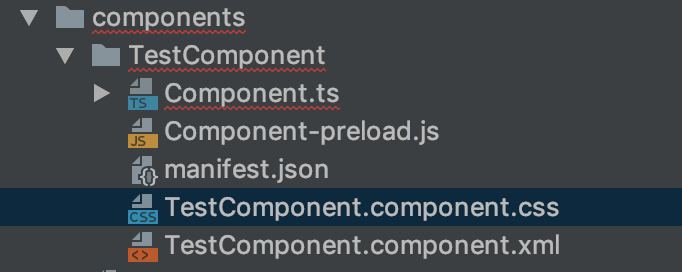
propagateModel="true"/>5. Component directory architecture - finally we have .component.xml with component content
I really like solution in Angular that we have all component stuff together:

I added to UIWebComponent class feature, that accept fragments with component.xml extension.
For each component you can add separate css file which will help with modularization (it comes with WebComponents features).
So in summary that's why I implemented:
6. Lifecycle methods from both UI5 and Custom Element
I added possibility to use all lifecycle methods from both technologies. You can use standard UI5 or you can take from Custom Element. In WebComponent class, I added reference to UI5 context. Enough to call it in Component.ts and all will be reflected.
SAPUI5
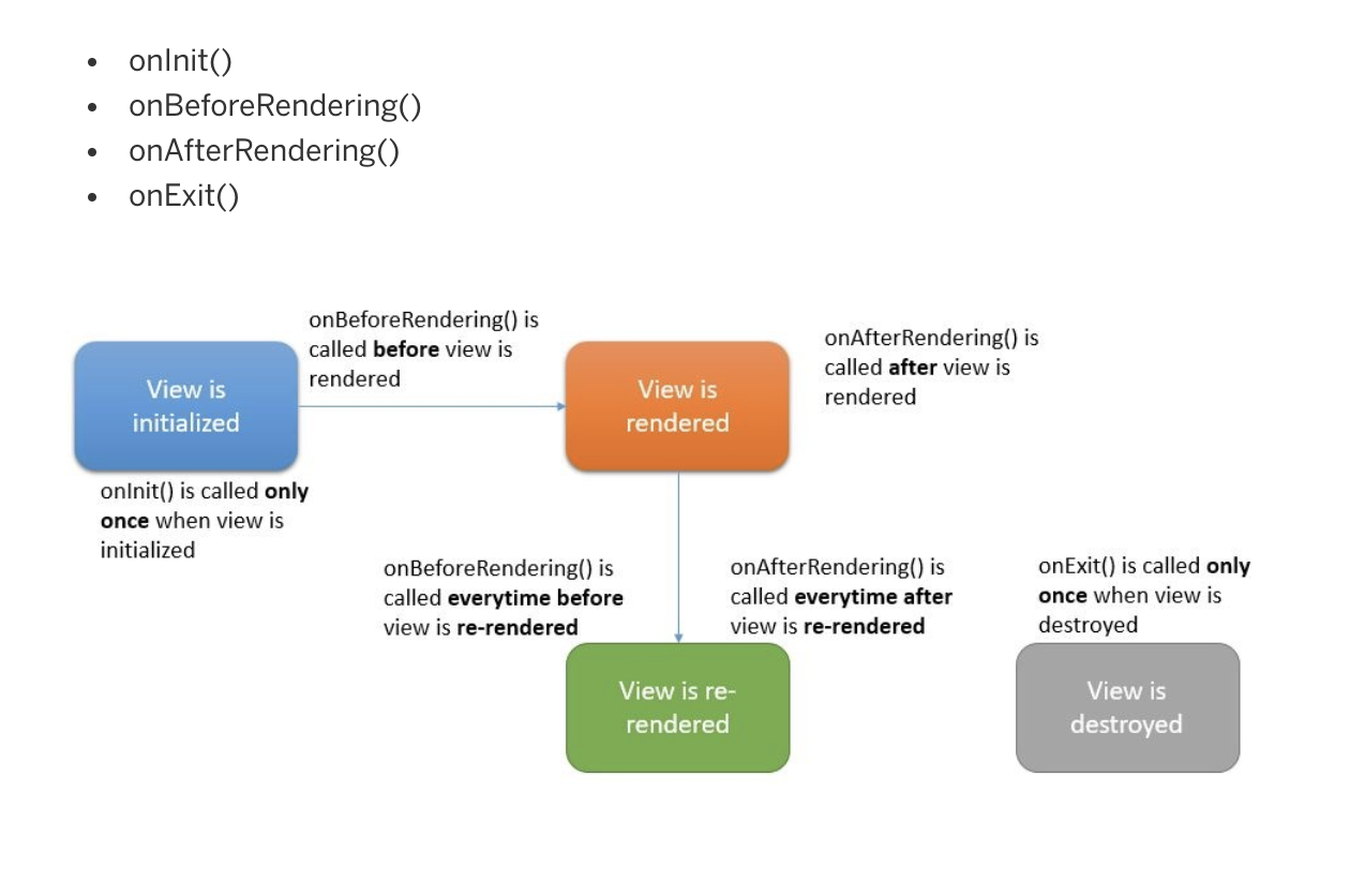
source (https://blogs.sap.com/2018/11/12/sapui5-controller-lifecycle-methods-explained/)
Custom Elements:
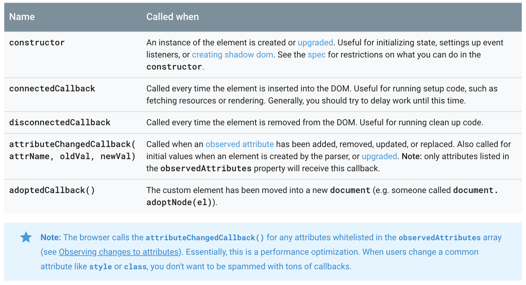
source (https://developers.google.com/web/fundamentals/web-components/customelements#reactions)
7. Attributes Observables
Custom Elements have possibility to observe attributes changes. Thanks to immediate updates of the attributes, I can observe and build my logic, for specific attribute. In component container settings I'm setting array, with names of observed attributes. Method attributeChangedCallback is called to resolve event, after attribute change.
Bellow similar functionalities across frameworks
| SAPUI5 | AngularJs | ReactJS | WebComponents | Polymer |
On change, custom implementation | Simple change | State change | Attributes change | Computed, observer properties |
8. Shadow DOM and light DOM with UI5 WebComponent
Custom Elements have possibility to be render in light DOM or shadow DOM (see https://developers.google.com/web/fundamentals/web-components/shadowdom)
I attached to my solution possibility, to choose which one should be used. This is declared during class initialization. If there is no info in component container settings then custom element is using light dom.
Rendering in shadow dom: Open
Rendering in light DOM

9. No more !important - override css sap classes in shadow DOM
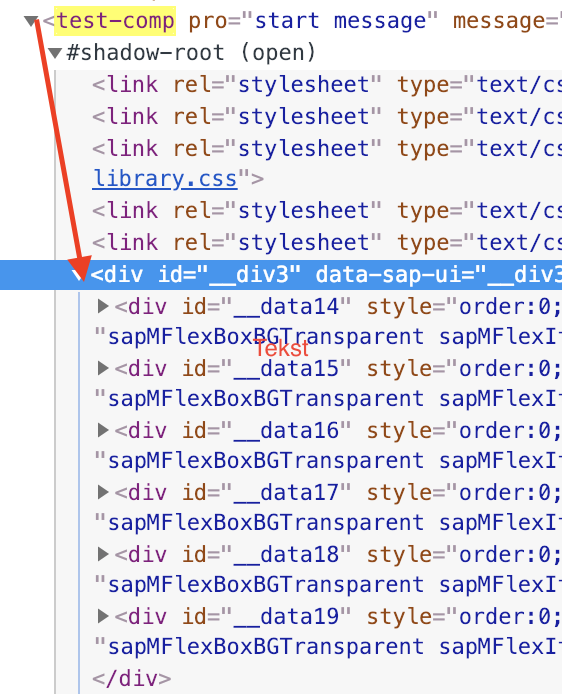
Shadow Dom has couple nice features. One of them is separation of css and js. If I want to render something in shadow DOM, I have to attach once again all css and js files, that were used for component. This is why I wrote method that check what sap libs that were loaded, attach css to Custom Element. This is happened only at the beginning.
// copy current loaded css links from ui5 config to custom element shadow dom

    public copyCurentSAPCss(): string {

        const loadedLibraries = Object.keys(sap.ui.getCore().getLoadedLibraries());

        let cssLinks = '';

        loadedLibraries.map((library: string) => {

            cssLinks += '<link rel="stylesheet" type="text/css" href="' +

                jQuery.sap.getResourcePath(library.replace(/\./g\ , "/"))+

                '/themes/' +

            sap.ui.getCore().getConfiguration().getTheme() + '/library.css">'

        })

        return cssLinks;

    }
In shadow DOM I had to copy also JS. I'm working on solution that will attach js files and manage events with proper scope.
Big advantage of shadow DOM is that, we can override sap base css class. Before we have to struggle. to have good selectors, to be treated by the browser with higher importance, or just use not suggested !important for new styles. Below example what the difference. Button with red font is in shadow dom. The other one is rendered with slot which comes from light dom.

Html look's like this. Last file is with my new class style:

10. Slots and templates
Slots and templates are nice possibility in Custom Elements (see documentation , slots docs in developer mozilla) to add placeholders at start template. After that browser puts in those placeholders some elements. Slots are existing in the shadow DOM.
Graphic representation of the simple template with slots, looks like that:
| <html tag> | <html tag> | <html tag> | <slot name="first" /> | <html tag> |
| <html tag> | <slot name="second" /> | <html tag> | <html tag> | <html tag> |
When custom element is called, I can attach to it html with elements, that are replacing slots:
<simple-custom-tag>

  <div>this is not slot</div>

  <div slot="second"> This is second slot</div>

  <div slot="first"> This is first slot</div>

  <div> last div</div>

</simple-custom-tag>
After rendering it will be look like this
| <html tag> | <html tag> | <html tag> | <html tag> | This is first slot |
| <html tag> | This is second slot | <html tag> | <html tag> | <html tag> |
- This is not slot
- last div
In my solution, I'm creating that kind of template in onBefore rendering method:
this.template = document.createElement('template');

this.template.innerHTML = cssLinks + `

<div></div>

<slot name="test"></slot>

<slot name="secondTest"></slot>

<div>last</div>

`;
This is passed, as initial html to Shadow DOM. It will be covered by the next step, which is Component.ts rendering process.
I'm replacing slots by xml template:
 oRM.write("><div slot='test' >"+

            oRM.getHTML(oComponent.oContent)+

            "</div><div slot='secondTest'>second</div></"+

            // close custom element tag

            oComponent.getProperty("htmlTag")+

            "></div></div>");
If I want to attach slot names to controls, to render directly without div/span html, it should be first updated class sap.ui.core.Control, which is base for each control.
Html template tag is not supported by IE (see more). In the past I used simple script tag:
<script type="text/template" id="someIdToCatch"></script>11. "slotschange" event handler
There is special event "slotchange" that I can attach to slot instance. In Component.ts, I'm adding Custom Element lifecycle method. I can attach event listener to this event.
 public connectedCallback(element: object):void{

        const slot = element.shadowRoot.querySelector('slot');

        slot.addEventListener('slotchange', e => {

            console.log('light dom children changed!');

        });

    }
12. Creating Custom Events, SAP EventBus, Component Events
WebComponents have standard event handlers (see more). We can create own Custom Events.
What are Events?
No matter in which technology, Events are incidents that are triggered, after f.e. button click. We can send with them data or just trigger another logic. There are always 2 sides of Events. One is publisher (which will be button that was clicked). Second one is subscription side (Event listeners). In UI5 we have EventBus (which is more like creator of Custom Events, see more) and EventProvider (for communication between controls) (see more).
We have to be aware that UI5 UIArea is taking care already of the standard events. In this situation we have to pay attention to not override something (if we don't want to). When we're working in shadow DOM, events are working locally. If we want to send them to rest DOM children/components we have to attach flag composed:true.
new Event('test-comp-click', {bubbles: true, composed: true})Here are example of event handling in different frameworks:
| SAPUI5 | AngularJs | ReactJS | WebComponents | Polymer |
EventBus Event Provider | Standard Events (property change, click), EventEmitter | Standard Events (state change, click) and EventEmitter | StandardStandard Events (property change, click) and Custom Events | Standard (f.e. property change, click) and Custom Events |
To work with Event Bus, I have to subscribe, to events that I want to follow, in init method.
To work with Custom Events with custom element, I have to use its connectedCallback method (see point 11).
Additionally in Component.ts metadata I can add list of events that can be used by the other parts of the application. can subscribe to those events and receive some information from component (see component doc) and (see custom controls doc)
13. And finally how to test QUnit and OPA5 tests
Due to the fact that we are using all time UI5 as a higher component we don't have to be worry about tests. Mostly everything is working as a standard UI5 app.
I had to attach to index.html link to WebComponents.
14. To be continue - roadmap with this project
- attach JS files / sap control events registration in shadow DOM
- dynamic css sap libs loader all the time for shadow DOM
- binding component properties to xml fragment -> Composite support
- writing test with typescript spec files
15. Project Updates:
Handling with Events.
UI5 is using JQuery.Events. UIArea (html document) is binding all events at the beginning. Because jQuery and shadowDom are totally historically/technologically in different place, one of the solution is creation shadow DOM listener handler. This is working as a host for shadowDom. I'm binding events listener for first div in shadow Dom. Now It listen click events. I'm resolving event in handleEvents method.
Communication between controls is working properly.
There was problem with elements selection in html page that are in shadowDom.
I had to prototype getDomRef method from Element class. All controls that are rendered in shadowDom have model with that contain component id. This method is called by all controls for every Dom update.
Element.prototype.getDomRef = function (sSuffix) {

    let DomRef = (((sSuffix ? this.getId() + "-" + sSuffix : this.getId())) ? window.document.getElementById(sSuffix ? this.getId() + "-" + sSuffix : this.getId()) : null);

    if (!DomRef && this.getModel("settingsModel")) {

        let oComponent = sap.ui.getCore().getComponent(this.getModel("settingsModel").oData.compId);

        if (sSuffix && oComponent.customElement) {

            DomRef = oComponent.customElement.shadowRoot.querySelector("#" + this.getId() + "-" + sSuffix);

        } else if (oComponent.customElement) {

            DomRef = oComponent.customElement.shadowRoot.querySelector("[id*='" + this.getId() + "']");

        }

    }

    return DomRef;

};
Css Links
All css libs are attaching automatically to all shadow dom templates.
Composite Support. We can bind model and component properties.
I added two aggregations:
LightDom and ShadowDom. Both of them have possibility to bind or models or properties from component. That's why this code will be resolved properly:
// property binding

<Button text="{$this>xmlTemplate}" type="Transparent" press="handlePress" />

// standard model binding

<Text text="{/message}" />
This change had impact to component architecture. There are two additional properties:
- xmlTemplateShadowDom (XML fragment) replace template (html created in JS)
- xmlTemplateLightDom(XML fragment)
xmlTemplateShadowDom:
I switched from template created in component to xml fragment. Unfortuantelly xmls notation for html and core:html don't support slots.I had to create two controls named Slot and Div that creating/ resolving slots:
<customControl:Div>

 <Button text="{$this>xmlTemplate}" type="Transparent" press="handlePress" />

 <Button text="{/message}" type="Transparent" press="handlePress" />

 <customControl:Slot name="test"></customControl:Slot>

 </customControl:Div>
Div is extension of FlexBox so has all features from this control, plus additionally bind slot name in html.
Slot is creating simple html slot with given name.
xmlTemplateLightDom :
This is part that will be rendered in light dom. In case that I want to resolve some slots created before, enough to use control Div with slot name, and everything will be attached properly by custom element.
<customControl:Div>

      <customControl:Div slot="test">

              <Button text="{/message}" type="Transparent" press="handlePress" />

              <Text text="{$this>template}" />

      </customControl:Div>

</customControl:Div>
Opa5 and QUnit test loaded dynamically with .spec.ts extension:
I changed architecture of the tests. Now All tests are in the files with .spec.ts extension and opa5|qunit mark. I don't have to take care of attaching tests to test list.... I can just create test and lite-server will take care of it.


I setup node lite server to check all dir to search files with this extension.
/opa5 -> route for opa5 tests

Opa5 has two properties. Test is responsible for test modules, view is containing opa5 pages (taken from view dir)
AllOpa5.ts consume and run Opa5 tests:
Helper.getRequest('/opa5')

    .then(response => {

        const fileList: Opa5Files = JSON.parse(response);

        Opa5.extendConfig({

            arrangements: new Common(),

            viewNamespace: "ui5.testApp.view."

        });

        sap.ui.require(fileList.view, () => {

            sap.ui.require(fileList.test, () => {

                QUnit.start();

            })

        })

    })
/qunit -> route for unit tests

AllQunit.ts consume and run qunit tests:
Helper.getRequest('/qunit')

    .then(response => {

        const fileList: Array<string> = JSON.parse(response);

        sap.ui.require(fileList, () => {

            QUnit.start();

        })

    })
Spec files are compiled, after each change. I setup to ignore them by typescript. This can be change in tsconfig file, but before run, tests, have to be compiled.
- SAP Managed Tags:
- SAPUI5
You must be a registered user to add a comment. If you've already registered, sign in. Otherwise, register and sign in.
Labels in this area
-
"automatische backups"
1 -
"regelmäßige sicherung"
1 -
"TypeScript" "Development" "FeedBack"
1 -
505 Technology Updates 53
1 -
ABAP
14 -
ABAP API
1 -
ABAP CDS Views
2 -
ABAP CDS Views - BW Extraction
1 -
ABAP CDS Views - CDC (Change Data Capture)
1 -
ABAP class
2 -
ABAP Cloud
3 -
ABAP Development
5 -
ABAP in Eclipse
1 -
ABAP Platform Trial
1 -
ABAP Programming
2 -
abap technical
1 -
abapGit
1 -
absl
2 -
access data from SAP Datasphere directly from Snowflake
1 -
Access data from SAP datasphere to Qliksense
1 -
Accrual
1 -
action
1 -
adapter modules
1 -
Addon
1 -
Adobe Document Services
1 -
ADS
1 -
ADS Config
1 -
ADS with ABAP
1 -
ADS with Java
1 -
ADT
2 -
Advance Shipping and Receiving
1 -
Advanced Event Mesh
3 -
Advanced formula
1 -
AEM
1 -
AI
8 -
AI Launchpad
1 -
AI Projects
1 -
AIML
9 -
Alert in Sap analytical cloud
1 -
Amazon S3
1 -
Analytical Dataset
1 -
Analytical Model
1 -
Analytics
1 -
Analyze Workload Data
1 -
annotations
1 -
API
1 -
API and Integration
3 -
API Call
2 -
API security
1 -
Application Architecture
1 -
Application Development
5 -
Application Development for SAP HANA Cloud
3 -
Applications and Business Processes (AP)
1 -
Artificial Intelligence
1 -
Artificial Intelligence (AI)
5 -
Artificial Intelligence (AI) 1 Business Trends 363 Business Trends 8 Digital Transformation with Cloud ERP (DT) 1 Event Information 462 Event Information 15 Expert Insights 114 Expert Insights 76 Life at SAP 418 Life at SAP 1 Product Updates 4
1 -
Artificial Intelligence (AI) blockchain Data & Analytics
1 -
Artificial Intelligence (AI) blockchain Data & Analytics Intelligent Enterprise
1 -
Artificial Intelligence (AI) blockchain Data & Analytics Intelligent Enterprise Oil Gas IoT Exploration Production
1 -
Artificial Intelligence (AI) blockchain Data & Analytics Intelligent Enterprise sustainability responsibility esg social compliance cybersecurity risk
1 -
ASE
1 -
ASR
2 -
ASUG
1 -
Attachments
1 -
Authorisations
1 -
Automating Processes
1 -
Automation
2 -
aws
2 -
Azure
1 -
Azure AI Studio
1 -
Azure API Center
1 -
Azure API Management
1 -
B2B Integration
1 -
Backorder Processing
1 -
Backup
1 -
Backup and Recovery
1 -
Backup schedule
1 -
BADI_MATERIAL_CHECK error message
1 -
Bank
1 -
Bank Communication Management
1 -
BAS
1 -
basis
2 -
Basis Monitoring & Tcodes with Key notes
2 -
Batch Management
1 -
BDC
1 -
Best Practice
1 -
bitcoin
1 -
Blockchain
3 -
bodl
1 -
BOP in aATP
1 -
BOP Segments
1 -
BOP Strategies
1 -
BOP Variant
1 -
BPC
1 -
BPC LIVE
1 -
BTP
13 -
BTP AI Launchpad
1 -
BTP Destination
2 -
Business AI
1 -
Business and IT Integration
1 -
Business application stu
1 -
Business Application Studio
1 -
Business Architecture
1 -
Business Communication Services
1 -
Business Continuity
1 -
Business Data Fabric
3 -
Business Fabric
1 -
Business Partner
12 -
Business Partner Master Data
10 -
Business Technology Platform
2 -
Business Trends
4 -
BW4HANA
1 -
CA
1 -
calculation view
1 -
CAP
4 -
Capgemini
1 -
CAPM
1 -
Catalyst for Efficiency: Revolutionizing SAP Integration Suite with Artificial Intelligence (AI) and
1 -
CCMS
2 -
CDQ
12 -
CDS
2 -
Cental Finance
1 -
Certificates
1 -
CFL
1 -
Change Management
1 -
chatbot
1 -
chatgpt
3 -
CL_SALV_TABLE
2 -
Class Runner
1 -
Classrunner
1 -
Cloud ALM Monitoring
1 -
Cloud ALM Operations
1 -
cloud connector
1 -
Cloud Extensibility
1 -
Cloud Foundry
4 -
Cloud Integration
6 -
Cloud Platform Integration
2 -
cloudalm
1 -
communication
1 -
Compensation Information Management
1 -
Compensation Management
1 -
Compliance
1 -
Compound Employee API
1 -
Configuration
1 -
Connectors
1 -
Consolidation Extension for SAP Analytics Cloud
2 -
Control Indicators.
1 -
Controller-Service-Repository pattern
1 -
Conversion
1 -
Cosine similarity
1 -
cryptocurrency
1 -
CSI
1 -
ctms
1 -
Custom chatbot
3 -
Custom Destination Service
1 -
custom fields
1 -
Customer Experience
1 -
Customer Journey
1 -
Customizing
1 -
cyber security
4 -
cybersecurity
1 -
Data
1 -
Data & Analytics
1 -
Data Aging
1 -
Data Analytics
2 -
Data and Analytics (DA)
1 -
Data Archiving
1 -
Data Back-up
1 -
Data Flow
1 -
Data Governance
5 -
Data Integration
2 -
Data Quality
12 -
Data Quality Management
12 -
Data Synchronization
1 -
data transfer
1 -
Data Unleashed
1 -
Data Value
8 -
database tables
1 -
Dataframe
1 -
Datasphere
3 -
datenbanksicherung
1 -
dba cockpit
1 -
dbacockpit
1 -
Debugging
2 -
Defender
1 -
Delimiting Pay Components
1 -
Delta Integrations
1 -
Destination
3 -
Destination Service
1 -
Developer extensibility
1 -
Developing with SAP Integration Suite
1 -
Devops
1 -
digital transformation
1 -
Documentation
1 -
Dot Product
1 -
DQM
1 -
dump database
1 -
dump transaction
1 -
e-Invoice
1 -
E4H Conversion
1 -
Eclipse ADT ABAP Development Tools
2 -
edoc
1 -
edocument
1 -
ELA
1 -
Embedded Consolidation
1 -
Embedding
1 -
Embeddings
1 -
Employee Central
1 -
Employee Central Payroll
1 -
Employee Central Time Off
1 -
Employee Information
1 -
Employee Rehires
1 -
Enable Now
1 -
Enable now manager
1 -
endpoint
1 -
Enhancement Request
1 -
Enterprise Architecture
1 -
ESLint
1 -
ETL Business Analytics with SAP Signavio
1 -
Euclidean distance
1 -
Event Dates
1 -
Event Driven Architecture
1 -
Event Mesh
2 -
Event Reason
1 -
EventBasedIntegration
1 -
EWM
1 -
EWM Outbound configuration
1 -
EWM-TM-Integration
1 -
Existing Event Changes
1 -
Expand
1 -
Expert
2 -
Expert Insights
2 -
Exploits
1 -
Fiori
14 -
Fiori Elements
2 -
Fiori SAPUI5
12 -
first-guidance
1 -
Flask
1 -
FTC
1 -
Full Stack
8 -
Funds Management
1 -
gCTS
1 -
GenAI hub
1 -
General
1 -
Generative AI
1 -
Getting Started
1 -
GitHub
9 -
Grants Management
1 -
groovy
1 -
GTP
1 -
HANA
6 -
HANA Cloud
2 -
Hana Cloud Database Integration
2 -
HANA DB
2 -
Hana Vector Engine
1 -
HANA XS Advanced
1 -
Historical Events
1 -
home labs
1 -
HowTo
1 -
HR Data Management
1 -
html5
8 -
HTML5 Application
1 -
Identity cards validation
1 -
idm
1 -
Implementation
1 -
Infuse AI
1 -
input parameter
1 -
instant payments
1 -
Integration
3 -
Integration Advisor
1 -
Integration Architecture
1 -
Integration Center
1 -
Integration Suite
1 -
intelligent enterprise
1 -
iot
1 -
Java
1 -
job
1 -
Job Information Changes
1 -
Job-Related Events
1 -
Job_Event_Information
1 -
joule
4 -
Journal Entries
1 -
Just Ask
1 -
Kerberos for ABAP
8 -
Kerberos for JAVA
8 -
KNN
1 -
Launch Wizard
1 -
Learning Content
2 -
Life at SAP
5 -
lightning
1 -
Linear Regression SAP HANA Cloud
1 -
Loading Indicator
1 -
local tax regulations
1 -
LP
1 -
Machine Learning
4 -
Marketing
1 -
Master Data
3 -
Master Data Management
14 -
Maxdb
2 -
MDG
1 -
MDGM
1 -
MDM
1 -
Message box.
1 -
Messages on RF Device
1 -
Microservices Architecture
1 -
Microsoft Universal Print
1 -
Middleware Solutions
1 -
Migration
5 -
ML Model Development
1 -
Modeling in SAP HANA Cloud
8 -
Monitoring
3 -
MTA
1 -
Multi-Record Scenarios
1 -
Multilayer Perceptron
1 -
Multiple Event Triggers
1 -
Myself Transformation
1 -
Neo
1 -
Neural Networks
1 -
New Event Creation
1 -
New Feature
1 -
Newcomer
1 -
NodeJS
3 -
ODATA
2 -
OData APIs
1 -
odatav2
1 -
ODATAV4
1 -
ODBC
1 -
ODBC Connection
1 -
Onpremise
1 -
open source
2 -
OpenAI API
1 -
Oracle
1 -
PaPM
1 -
PaPM Dynamic Data Copy through Writer function
1 -
PaPM Remote Call
1 -
Partner Built Foundation Model
1 -
PAS-C01
1 -
Pay Component Management
1 -
PGP
1 -
Pickle
1 -
PLANNING ARCHITECTURE
1 -
Popup in Sap analytical cloud
1 -
PostgrSQL
1 -
POSTMAN
1 -
Prettier
1 -
Process Automation
2 -
Product Updates
6 -
PSM
1 -
Public Cloud
1 -
Python
4 -
python library - Document information extraction service
1 -
Qlik
1 -
Qualtrics
1 -
RAP
3 -
RAP BO
2 -
Record Deletion
1 -
Recovery
1 -
recurring payments
1 -
redeply
1 -
Release
1 -
Remote Consumption Model
1 -
Replication Flows
1 -
research
1 -
Resilience
1 -
REST
1 -
REST API
1 -
Retagging Required
1 -
Risk
1 -
Rolling Kernel Switch
1 -
route
1 -
rules
1 -
S4 HANA
1 -
S4 HANA Cloud
1 -
S4 HANA On-Premise
1 -
S4HANA
4 -
S4HANA Cloud
1 -
S4HANA_OP_2023
2 -
SAC
10 -
SAC PLANNING
9 -
SAP
4 -
SAP ABAP
1 -
SAP Advanced Event Mesh
1 -
SAP AI Core
9 -
SAP AI Launchpad
8 -
SAP Analytic Cloud Compass
1 -
Sap Analytical Cloud
1 -
SAP Analytics Cloud
4 -
SAP Analytics Cloud for Consolidation
3 -
SAP Analytics Cloud Story
1 -
SAP analytics clouds
1 -
SAP API Management
1 -
SAP BAS
1 -
SAP Basis
6 -
SAP BODS
1 -
SAP BODS certification.
1 -
SAP BTP
22 -
SAP BTP Build Work Zone
2 -
SAP BTP Cloud Foundry
6 -
SAP BTP Costing
1 -
SAP BTP CTMS
1 -
SAP BTP Generative AI
1 -
SAP BTP Innovation
1 -
SAP BTP Migration Tool
1 -
SAP BTP SDK IOS
1 -
SAP BTPEA
1 -
SAP Build
11 -
SAP Build App
1 -
SAP Build apps
1 -
SAP Build CodeJam
1 -
SAP Build Process Automation
3 -
SAP Build work zone
10 -
SAP Business Objects Platform
1 -
SAP Business Technology
2 -
SAP Business Technology Platform (XP)
1 -
sap bw
1 -
SAP CAP
2 -
SAP CDC
1 -
SAP CDP
1 -
SAP CDS VIEW
1 -
SAP Certification
1 -
SAP Cloud ALM
4 -
SAP Cloud Application Programming Model
1 -
SAP Cloud Integration for Data Services
1 -
SAP cloud platform
8 -
SAP Companion
1 -
SAP CPI
3 -
SAP CPI (Cloud Platform Integration)
2 -
SAP CPI Discover tab
1 -
sap credential store
1 -
SAP Customer Data Cloud
1 -
SAP Customer Data Platform
1 -
SAP Data Intelligence
1 -
SAP Data Migration in Retail Industry
1 -
SAP Data Services
1 -
SAP DATABASE
1 -
SAP Dataspher to Non SAP BI tools
1 -
SAP Datasphere
9 -
SAP DRC
1 -
SAP EWM
1 -
SAP Fiori
3 -
SAP Fiori App Embedding
1 -
Sap Fiori Extension Project Using BAS
1 -
SAP GRC
1 -
SAP HANA
1 -
SAP HANA PAL
1 -
SAP HANA Vector
1 -
SAP HCM (Human Capital Management)
1 -
SAP HR Solutions
1 -
SAP IDM
1 -
SAP Integration Suite
9 -
SAP Integrations
4 -
SAP iRPA
2 -
SAP LAGGING AND SLOW
1 -
SAP Learning Class
1 -
SAP Learning Hub
1 -
SAP Master Data
1 -
SAP Odata
2 -
SAP on Azure
2 -
SAP PAL
1 -
SAP PartnerEdge
1 -
sap partners
1 -
SAP Password Reset
1 -
SAP PO Migration
1 -
SAP Prepackaged Content
1 -
SAP Process Automation
2 -
SAP Process Integration
2 -
SAP Process Orchestration
1 -
SAP S4HANA
2 -
SAP S4HANA Cloud
1 -
SAP S4HANA Cloud for Finance
1 -
SAP S4HANA Cloud private edition
1 -
SAP Sandbox
1 -
SAP STMS
1 -
SAP successfactors
3 -
SAP SuccessFactors HXM Core
1 -
SAP Time
1 -
SAP TM
2 -
SAP Trading Partner Management
1 -
SAP UI5
1 -
SAP Upgrade
1 -
SAP Utilities
1 -
SAP-GUI
8 -
SAP_COM_0276
1 -
SAPBTP
1 -
SAPCPI
1 -
SAPEWM
1 -
sapfirstguidance
1 -
SAPHANAService
1 -
SAPIQ
1 -
sapmentors
1 -
saponaws
2 -
SAPS4HANA
1 -
SAPUI5
5 -
schedule
1 -
Script Operator
1 -
Secure Login Client Setup
8 -
security
9 -
Selenium Testing
1 -
Self Transformation
1 -
Self-Transformation
1 -
SEN
1 -
SEN Manager
1 -
service
1 -
SET_CELL_TYPE
1 -
SET_CELL_TYPE_COLUMN
1 -
SFTP scenario
2 -
Simplex
1 -
Single Sign On
8 -
Singlesource
1 -
SKLearn
1 -
Slow loading
1 -
soap
1 -
Software Development
1 -
SOLMAN
1 -
solman 7.2
2 -
Solution Manager
3 -
sp_dumpdb
1 -
sp_dumptrans
1 -
SQL
1 -
sql script
1 -
SSL
8 -
SSO
8 -
Substring function
1 -
SuccessFactors
1 -
SuccessFactors Platform
1 -
SuccessFactors Time Tracking
1 -
Sybase
1 -
system copy method
1 -
System owner
1 -
Table splitting
1 -
Tax Integration
1 -
Technical article
1 -
Technical articles
1 -
Technology Updates
15 -
Technology Updates
1 -
Technology_Updates
1 -
terraform
1 -
Threats
2 -
Time Collectors
1 -
Time Off
2 -
Time Sheet
1 -
Time Sheet SAP SuccessFactors Time Tracking
1 -
Tips and tricks
2 -
toggle button
1 -
Tools
1 -
Trainings & Certifications
1 -
Transformation Flow
1 -
Transport in SAP BODS
1 -
Transport Management
1 -
TypeScript
3 -
ui designer
1 -
unbind
1 -
Unified Customer Profile
1 -
UPB
1 -
Use of Parameters for Data Copy in PaPM
1 -
User Unlock
1 -
VA02
1 -
Validations
1 -
Vector Database
2 -
Vector Engine
1 -
Vectorization
1 -
Visual Studio Code
1 -
VSCode
2 -
VSCode extenions
1 -
Vulnerabilities
1 -
Web SDK
1 -
work zone
1 -
workload
1 -
xsa
1 -
XSA Refresh
1
- « Previous
- Next »
Related Content
- Incentive Management OData APIs (Kubernetes) Questions in Technology Q&A
- Error: javax.xml.transform.TransformerException: Source object passed to ''{0}'' has no contents. in Technology Q&A
- SAP Cloud ALM and ServiceNow Integration - has it worked for anyone? in Technology Q&A
- providing IAS authentication through cloud identity service for UI5 MTA app in Technology Q&A
- Sign in with an Email link - New upcoming feature for SAP Concur in Q2 2024 in Technology Blogs by SAP
Top kudoed authors
| User | Count |
|---|---|
| 10 | |
| 8 | |
| 5 | |
| 4 | |
| 4 | |
| 4 | |
| 4 | |
| 4 | |
| 3 | |
| 3 |