
- SAP Community
- Products and Technology
- Technology
- Technology Blogs by SAP
- Reliable grid layout in SAP Build Apps
Technology Blogs by SAP
Learn how to extend and personalize SAP applications. Follow the SAP technology blog for insights into SAP BTP, ABAP, SAP Analytics Cloud, SAP HANA, and more.
Turn on suggestions
Auto-suggest helps you quickly narrow down your search results by suggesting possible matches as you type.
Showing results for
 merituulimelkko
Product and Topic Expert
Options
- Subscribe to RSS Feed
- Mark as New
- Mark as Read
- Bookmark
- Subscribe
- Printer Friendly Page
- Report Inappropriate Content
03-13-2023
8:03 AM
If you've ever tried to layout things in a grid using SAP Build Apps, you might have noticed that it's not as easy as you might think it would be. In this blog I will teach you how to make responsive grids that look just the way you'd expect them to!
Disclaimer: This grid functionality is made works for both web and mobile, BUT if web has navigation menu enabled, the layout will not work out of the box correctly for just one card, and the formula will have to be adjusted accordingly.
---
The basis of my grid structure consists of two Container components within each other. The outer container is in this app called Questions and the inner container is Card. The purpose of the outer Questions container is to be a horizontal container with wrap enabled. Due to this, when we repeat the inner Card container with data, the cards will follow horizontally and then wrap to new rows when there is more than will fit the screen in one go.
The role of the inner Card container is to display the grid items and take care of all the grid items being the same size and otherwise look the same. Repeat the Card container with your data.
Now, before any customization to the width or height is done, your repeated data will look something like this:
This is not yet what we want, so onto the next step we go!
---
Surprisingly, the gaps between cards and the page's paddings are a crucial part of getting the grid to look right.
First, set the Card containers gaps to be as you desire. In a typical grid, the gap should be the same to the right as it is to the top (or bottom if you choose to use bottom instead of top). Take note of the gap you set to be to the right + left of the component, as you will need this number of pixels in step 3. For me this number is 16px + 0px, so 16px. The formulas in the next step might not work if you also set left gap, so only set one of them if possible.
Next, you'll want to set the page paddings, and this will affect all the components on the page.
Why do you need to set page paddings, you ask? Good question, but frustrating answer: because there's an unavoidable gap to the right of every wrapped row that you can't remove, and the way to make it unnoticeable for the user is to do this trick with the page padding.
Remove as much from the page padding to the right as you set as the right gap in the previous part. 16px in my case. Take also note of the total padding of the page on the left and right. 32px + 16px = 48px in my case.
Now you'll need to add this to all of the rest of the components on the page. I do this by chucking everything else on the page in a container or two and giving those containers the same amount of right padding as I removed from the page padding, and the issue is gone.
---
Now that everything else has been prepped, to get our desired grid effect on Card, we will be using the "Advanced" section under "Layout" properties.
These are the only values you need to set, and if you don't care how small the card may get, you can skip the minimum width. Set the height to the height you want every item to be.
The magic itself happens in the formula I've set for the width. I wanted the grid to have a different amount of cards depending on how wide the available viewport is, so I'm using systemVars.dimensions.viewport.width in my calculations. I recommend to always using viewport instead of screen or window, since this will give the most usable value for both mobile and web. Viewport is the size of the browser or on mobile the size of the screen available for the app.
After determining how wide the screen is and choosing how many cards I want to be shown (4, 3, 2 or 1), I need to do some deductions to take into account the page paddings and the gaps between the cards: deduct the page paddings from the whole width of the viewport, and once you've divided that available width for the cards to as many cards as you want displayed for that specific screen width, you also remove 16px for the gaps between the components.
(Note that the formula for the smallest viewport width will have to be adjusted if you have navigation menu enabled!)
---
All the containers above are set by default to hide overflowing content, and that is as should be. However, if you have a text or multiple texts that may be of varying lengths, you might want to make sure that it is cut off early before it pushes the other content out of the container, which leaves them out of sight.
To prevent texts from taking too much space, you could use the TRUNCATE formula after a certain amount of characters, but you never know how many rows that may or may not be. Instead, I recommend using the Number of lines property of the text. Here I've set one of the content texts to have a maximum of 3 lines.
I've also set the top-most text in a Container with a custom height and width so that it will grow to fill the space that is available and the rest of the content is always aligned at the bottom of the Card container.
---
There you have it, a responsive grid with no weird alignments for the last item and with different amount of items for different screen widths. Let me know in the comments if you have any questions or remarks 🙂
For more blog posts on relevant topics, check out the SAP Builders Group!
Disclaimer: This grid functionality is made works for both web and mobile, BUT if web has navigation menu enabled, the layout will not work out of the box correctly for just one card, and the formula will have to be adjusted accordingly.
---
Step 1: Basic structure
The basis of my grid structure consists of two Container components within each other. The outer container is in this app called Questions and the inner container is Card. The purpose of the outer Questions container is to be a horizontal container with wrap enabled. Due to this, when we repeat the inner Card container with data, the cards will follow horizontally and then wrap to new rows when there is more than will fit the screen in one go.

Screenshot of the configuration of the Question container
The role of the inner Card container is to display the grid items and take care of all the grid items being the same size and otherwise look the same. Repeat the Card container with your data.
Now, before any customization to the width or height is done, your repeated data will look something like this:

Screenshot from the app – the cards are of varying heights and widths and the last item of the list is wider than any other
This is not yet what we want, so onto the next step we go!
---
Step 2: Gaps and paddings
Surprisingly, the gaps between cards and the page's paddings are a crucial part of getting the grid to look right.
First, set the Card containers gaps to be as you desire. In a typical grid, the gap should be the same to the right as it is to the top (or bottom if you choose to use bottom instead of top). Take note of the gap you set to be to the right + left of the component, as you will need this number of pixels in step 3. For me this number is 16px + 0px, so 16px. The formulas in the next step might not work if you also set left gap, so only set one of them if possible.

Screenshot of Card's gap configuration
Next, you'll want to set the page paddings, and this will affect all the components on the page.
Why do you need to set page paddings, you ask? Good question, but frustrating answer: because there's an unavoidable gap to the right of every wrapped row that you can't remove, and the way to make it unnoticeable for the user is to do this trick with the page padding.
Remove as much from the page padding to the right as you set as the right gap in the previous part. 16px in my case. Take also note of the total padding of the page on the left and right. 32px + 16px = 48px in my case.
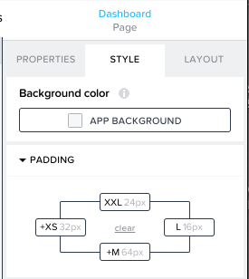
Screenshot of the page padding's configuration
Now you'll need to add this to all of the rest of the components on the page. I do this by chucking everything else on the page in a container or two and giving those containers the same amount of right padding as I removed from the page padding, and the issue is gone.

Screenshot of the configuration of a container for the rest of the page, showing the added 16px for the right padding
---
Step 3: Define advanced height and width for card
Now that everything else has been prepped, to get our desired grid effect on Card, we will be using the "Advanced" section under "Layout" properties.

Screenshot of Card container's width and height configurations
These are the only values you need to set, and if you don't care how small the card may get, you can skip the minimum width. Set the height to the height you want every item to be.
The magic itself happens in the formula I've set for the width. I wanted the grid to have a different amount of cards depending on how wide the available viewport is, so I'm using systemVars.dimensions.viewport.width in my calculations. I recommend to always using viewport instead of screen or window, since this will give the most usable value for both mobile and web. Viewport is the size of the browser or on mobile the size of the screen available for the app.
After determining how wide the screen is and choosing how many cards I want to be shown (4, 3, 2 or 1), I need to do some deductions to take into account the page paddings and the gaps between the cards: deduct the page paddings from the whole width of the viewport, and once you've divided that available width for the cards to as many cards as you want displayed for that specific screen width, you also remove 16px for the gaps between the components.
IF(systemVars.dimensions.viewport.width>1500, (systemVars.dimensions.viewport.width-48)/4-16,

IF(systemVars.dimensions.viewport.width>1000, (systemVars.dimensions.viewport.width-48)/3-16,

IF(systemVars.dimensions.viewport.width>700, (systemVars.dimensions.viewport.width-48)/2-16,

systemVars.dimensions.viewport.width-48-16)))
(Note that the formula for the smallest viewport width will have to be adjusted if you have navigation menu enabled!)
---
Optional: Tips for keeping content from overflowing
All the containers above are set by default to hide overflowing content, and that is as should be. However, if you have a text or multiple texts that may be of varying lengths, you might want to make sure that it is cut off early before it pushes the other content out of the container, which leaves them out of sight.
To prevent texts from taking too much space, you could use the TRUNCATE formula after a certain amount of characters, but you never know how many rows that may or may not be. Instead, I recommend using the Number of lines property of the text. Here I've set one of the content texts to have a maximum of 3 lines.

Screenshot of a content text's configuration
I've also set the top-most text in a Container with a custom height and width so that it will grow to fill the space that is available and the rest of the content is always aligned at the bottom of the Card container.

Screenshot of the text container's width and height

Screenshot of a single card in the app with proper alignment
---
Done!
There you have it, a responsive grid with no weird alignments for the last item and with different amount of items for different screen widths. Let me know in the comments if you have any questions or remarks 🙂
For more blog posts on relevant topics, check out the SAP Builders Group!
- SAP Managed Tags:
- SAP Build Apps
Labels:
You must be a registered user to add a comment. If you've already registered, sign in. Otherwise, register and sign in.
Labels in this area
-
ABAP CDS Views - CDC (Change Data Capture)
2 -
AI
1 -
Analyze Workload Data
1 -
BTP
1 -
Business and IT Integration
2 -
Business application stu
1 -
Business Technology Platform
1 -
Business Trends
1,658 -
Business Trends
105 -
CAP
1 -
cf
1 -
Cloud Foundry
1 -
Confluent
1 -
Customer COE Basics and Fundamentals
1 -
Customer COE Latest and Greatest
3 -
Customer Data Browser app
1 -
Data Analysis Tool
1 -
data migration
1 -
data transfer
1 -
Datasphere
2 -
Event Information
1,400 -
Event Information
69 -
Expert
1 -
Expert Insights
177 -
Expert Insights
330 -
General
1 -
Google cloud
1 -
Google Next'24
1 -
GraphQL
1 -
Kafka
1 -
Life at SAP
780 -
Life at SAP
13 -
Migrate your Data App
1 -
MTA
1 -
Network Performance Analysis
1 -
NodeJS
1 -
PDF
1 -
POC
1 -
Product Updates
4,575 -
Product Updates
375 -
Replication Flow
1 -
REST API
1 -
RisewithSAP
1 -
SAP BTP
1 -
SAP BTP Cloud Foundry
1 -
SAP Cloud ALM
1 -
SAP Cloud Application Programming Model
1 -
SAP Datasphere
2 -
SAP S4HANA Cloud
1 -
SAP S4HANA Migration Cockpit
1 -
Technology Updates
6,872 -
Technology Updates
460 -
Workload Fluctuations
1
Related Content
- Digital Twins of an Organization: why worth it and why now in Technology Blogs by SAP
- 10+ ways to reshape your SAP landscape with SAP Business Technology Platform – Blog 7 in Technology Blogs by SAP
- SAP Datasphere + SAP S/4HANA: Your Guide to Seamless Data Integration in Technology Blogs by SAP
- How to create a rolling forecast in SAC? I have an actual and budget version for 2024. in Technology Q&A
- Composite Data Source Configuration in Optimized Story Experience in Technology Blogs by SAP
Top kudoed authors
| User | Count |
|---|---|
| 16 | |
| 11 | |
| 9 | |
| 7 | |
| 7 | |
| 6 | |
| 6 | |
| 5 | |
| 5 | |
| 4 |