
- SAP Community
- Products and Technology
- Human Capital Management
- HCM Blogs by Members
- Ever Heard You Can't Do That With SuccessFactors R...
Human Capital Management Blogs by Members
Gain valuable knowledge and tips on SAP SuccessFactors HCM suite and human capital management market from member blog posts. Share your insights with a post of your own.
Turn on suggestions
Auto-suggest helps you quickly narrow down your search results by suggesting possible matches as you type.
Showing results for
kaylatoelle
Active Participant
Options
- Subscribe to RSS Feed
- Mark as New
- Mark as Read
- Bookmark
- Subscribe
- Printer Friendly Page
- Report Inappropriate Content
06-21-2018
8:02 PM
In case you missed some of our custom report examples at SuccessConnect Berlin, I wanted to share some of my favorite examples of our customers’ custom reports that Veritas Prime has built. As I’ve said in previous blogs, I started working with SuccessFactors on the client side and one of my responsibilities was reporting and analytics. Every time I had to re-create one of the weekly/monthly/quarterly/annual reports, I found myself frustrated with the limitations of standard reporting and my duplication of effort. Thankfully, custom reporting is the answer to these issues.
As we all await the upcoming roadmap and changes to reporting, YouCalc Dashboards and BIRT reports are great ways to visualize your data and reduce the time spent on re-creating reports each period. They recently released an estimated timeline and as of now, you will still be able to use your existing reports for at least 2 years after SAP Analytics Cloud is live. For part one of this blog, I will be providing some examples of YouCalc Dashboards. For part two, I will cover BIRT reports.
In case you are new to SuccessFactors reporting, there are several different reporting options within SuccessFactors and sometimes it can be a little confusing. This blog by robertwood does a great job breaking it down and explaining what each tool is best used for!
SuccessFactors has done a great job of creating standard dashboards for performance, goals, and succession but for modules that are highly customizable, custom dashboards give HR and managers at all levels insight into their employee’s data. YouCalc can pull data from SuccessFactors Ad Hoc reports, API, Workforce Analytics, and FTP sites.
Some benefits of a custom dashboard:
Below are some examples of our clients’ dashboards. All of these have been built by Veritas Prime and the screenshots are with dummy/test data.
The below dashboard combines basic operational EC data with workflow data.

A dashboard to summarize your recruiting process. This is one of our most used dashboards because it can be re-mapped to a client’s requisition templates.

A dashboard to summarize your compensation process. We have several clients that screenshot this one and send it as a daily summary at the end of every day during the compensation review cycle.
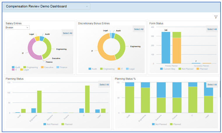
Dashboards for managers and HR to give additional insight into the compensation planning process.


Not only can you customize the metrics tab on the compensation template but we had a client that wanted to customize the budgets section so the standard budget tab was disabled and it was re-created on the metrics tab.

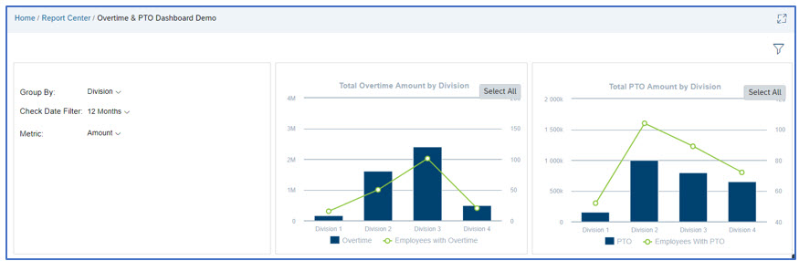
Below is an example of a dashboard we built for a client that pulled data from their time/payroll system and visualized it in SuccessFactors for Managers and HR.
Since we can pull from additional sources, you can visualize your learning data and gain additional insight into courses within additional seats and enrollment numbers. The below dashboard was built by dwayne.phillips for a client to provide information on their courses. We have come up with ways to create Manager, User and Administrative dashboards at the BizX level to allow for a more consistent view for your users. We even offer tiles for this data on the homepage if a dashboard is more than you are looking for.

With the ability to join data from an Ad Hoc report with an API query, we have come up with some creative ways to use YouCalc Dashboards to fill gaps and simplify processes.
Below is an example of a dashboard that creates the import files for compensation and variable pay. A similar approach has been used to create the EC import files!

For a non-EC integrated compensation template, you can create a dashboard that generates the recurring and non-recurring payment load files.

For US companies with government contracts, the below dashboards can be used to create your affirmative action reports. This can be used to create the actual file or the files needed by your third party provider.

YouCalc is a powerful reporting tool that opens up a lot of possibilities for custom reporting to better visualize your information and simplify your processes. Hopefully some of these examples appealed to you and can help you understand the benefits of having a partner create custom dashboards for you. Make sure to check out part 2 on BIRT reports coming out next month
As we all await the upcoming roadmap and changes to reporting, YouCalc Dashboards and BIRT reports are great ways to visualize your data and reduce the time spent on re-creating reports each period. They recently released an estimated timeline and as of now, you will still be able to use your existing reports for at least 2 years after SAP Analytics Cloud is live. For part one of this blog, I will be providing some examples of YouCalc Dashboards. For part two, I will cover BIRT reports.
In case you are new to SuccessFactors reporting, there are several different reporting options within SuccessFactors and sometimes it can be a little confusing. This blog by robertwood does a great job breaking it down and explaining what each tool is best used for!
YouCalc Dashboards
SuccessFactors has done a great job of creating standard dashboards for performance, goals, and succession but for modules that are highly customizable, custom dashboards give HR and managers at all levels insight into their employee’s data. YouCalc can pull data from SuccessFactors Ad Hoc reports, API, Workforce Analytics, and FTP sites.
Some benefits of a custom dashboard:
- Pull data from multiple data sources
- Pull data from 3rd party system and join with SuccessFactors data
- Multiple metrics and aggregations
- Pivot drop down which reduces the number of tiles
- Custom calculations
- Export multiple reports within one report
Below are some examples of our clients’ dashboards. All of these have been built by Veritas Prime and the screenshots are with dummy/test data.
Examples:
The below dashboard combines basic operational EC data with workflow data.
A dashboard to summarize your recruiting process. This is one of our most used dashboards because it can be re-mapped to a client’s requisition templates.
A dashboard to summarize your compensation process. We have several clients that screenshot this one and send it as a daily summary at the end of every day during the compensation review cycle.
Dashboards for managers and HR to give additional insight into the compensation planning process.
Not only can you customize the metrics tab on the compensation template but we had a client that wanted to customize the budgets section so the standard budget tab was disabled and it was re-created on the metrics tab.
Below is an example of a dashboard we built for a client that pulled data from their time/payroll system and visualized it in SuccessFactors for Managers and HR.
Since we can pull from additional sources, you can visualize your learning data and gain additional insight into courses within additional seats and enrollment numbers. The below dashboard was built by dwayne.phillips for a client to provide information on their courses. We have come up with ways to create Manager, User and Administrative dashboards at the BizX level to allow for a more consistent view for your users. We even offer tiles for this data on the homepage if a dashboard is more than you are looking for.
Non-Conventional Uses of Dashboards:
With the ability to join data from an Ad Hoc report with an API query, we have come up with some creative ways to use YouCalc Dashboards to fill gaps and simplify processes.
Below is an example of a dashboard that creates the import files for compensation and variable pay. A similar approach has been used to create the EC import files!
For a non-EC integrated compensation template, you can create a dashboard that generates the recurring and non-recurring payment load files.
For US companies with government contracts, the below dashboards can be used to create your affirmative action reports. This can be used to create the actual file or the files needed by your third party provider.
YouCalc is a powerful reporting tool that opens up a lot of possibilities for custom reporting to better visualize your information and simplify your processes. Hopefully some of these examples appealed to you and can help you understand the benefits of having a partner create custom dashboards for you. Make sure to check out part 2 on BIRT reports coming out next month
- SAP Managed Tags:
- SAP SuccessFactors Compensation,
- SAP SuccessFactors Employee Central,
- SAP SuccessFactors Employee Central - Employee Profile,
- SAP SuccessFactors HXM Suite,
- SAP SuccessFactors Learning,
- SAP SuccessFactors Performance & Goals,
- SAP SuccessFactors platform,
- SAP SuccessFactors Recruiting,
- SAP SuccessFactors Succession & Development,
- SAP SuccessFactors Workforce Analytics,
- SAP SuccessFactors HXM Core,
- SAP SuccessFactors Learning Marketplace,
- SAP SuccessFactors Workforce Planning,
- HCM (Human Capital Management)
2 Comments
You must be a registered user to add a comment. If you've already registered, sign in. Otherwise, register and sign in.
Labels in this area
-
1H 2024 Product Release
5 -
2H 2023 Product Release
1 -
ACCRUAL TRANSFER
1 -
Advanced Workflow
1 -
AI
1 -
AI & Skills Ontology
1 -
Anonymization
1 -
BTP
1 -
Business Rules
1 -
Canvas Report
1 -
Career Development
1 -
Certificate-Based Authentication
1 -
Cloud Platform Integration
1 -
Compensation
1 -
Compensation Information Management
1 -
Compensation Management
1 -
Compliance
2 -
Content
1 -
Conversational AI
2 -
Custom Data Collection
1 -
custom portlet
1 -
Data & Analytics
1 -
Data Integration
1 -
Dayforce
1 -
deep link
1 -
deeplink
1 -
Delimiting Pay Components
1 -
Deprecation
1 -
Employee Central
1 -
Employee Central Global Benefits
1 -
Employee Central Payroll
1 -
employee profile
1 -
Employee Rehires
1 -
external terminal
1 -
external time events
1 -
Generative AI
2 -
Getting Started
1 -
Global Benefits
1 -
Guidelines
1 -
h12024
1 -
H2 2023
1 -
HR
2 -
HR Data Management
1 -
HR Transformation
1 -
ilx
1 -
Incentive Management Setup (Configuration)
1 -
Integration Center
2 -
Integration Suite
1 -
internal mobility
1 -
Introduction
1 -
learning
3 -
LMS
2 -
LXP
1 -
Massively MDF attachments download
1 -
Mentoring
1 -
Metadata Framework
1 -
Middleware Solutions
1 -
OCN
1 -
OData APIs
1 -
ONB USA Compliance
1 -
Onboarding
2 -
Opportunity Marketplace
1 -
Pay Component Management
1 -
Platform
1 -
portlet
1 -
POSTMAN
1 -
Predictive AI
2 -
Recruiting
1 -
recurring payments
1 -
Role Based Permissions (RBP)
2 -
SAP Build CodeJam
1 -
SAP Build Marketplace
1 -
SAP CPI (Cloud Platform Integration)
1 -
SAP HCM (Human Capital Management)
2 -
SAP HR Solutions
2 -
SAP Integrations
1 -
SAP release
1 -
SAP successfactors
5 -
SAP SuccessFactors Customer Community
1 -
SAP SuccessFactors OData API
1 -
SAP Workzone
1 -
SAP-PAYROLL
1 -
skills
1 -
Skills Management
1 -
sso deeplink
1 -
Stories in People Analytics
3 -
Story Report
1 -
SuccessFactors
3 -
SuccessFactors Employee central home page customization.
1 -
SuccessFactors Onboarding
1 -
successfactors onboarding i9
1 -
Table Report
1 -
talent
1 -
Talent Intelligence Hub
2 -
talentintelligencehub
1 -
talents
1 -
Tax
1 -
Tax Integration
1 -
TIH
1 -
Time Accounts
1 -
Workflows
1 -
XML Rules
1
- « Previous
- Next »
Related Content
- SuccessFactors Report Story: Calculating percentiles in Human Capital Management Q&A
- Successfactors story report maximum date in Human Capital Management Q&A
- SAP SuccessFactors Talent Intelligence Hub H1 2024 Release Insights in Human Capital Management Blogs by Members
- New 1H 2024 SAP Successfactors Time (Tracking) Features in Human Capital Management Blogs by SAP
- 3 key steps to kick-start your migration to Stories in People Analytics in Human Capital Management Blogs by Members
Top kudoed authors
| User | Count |
|---|---|
| 3 | |
| 3 | |
| 3 | |
| 3 | |
| 2 | |
| 1 | |
| 1 | |
| 1 | |
| 1 | |
| 1 |