- SAP Community
- Products and Technology
- Technology
- Technology Blogs by SAP
- SAP Analytics Cloud: Custom Widget & Widget Add-On...
- Subscribe to RSS Feed
- Mark as New
- Mark as Read
- Bookmark
- Subscribe
- Printer Friendly Page
- Report Inappropriate Content
Background
Now that Custom Widget is available with the Unified Story Experience since QRC/Q2 - 2023, and Widget Add-Ons since QRC/Q4 - 2023, we received a large amount of requests coming from SAC users searching for Samples in order to extend the Built-in set of visualisations in SAC.
In this article, I will highlight the Ready-To-Use Custom Widget Samples available in the SAP Public GitHub repository which you can download, edit and consume within SAP Analytics Cloud. You can use these Samples as a starting point to learn how to develop Custom Widget.
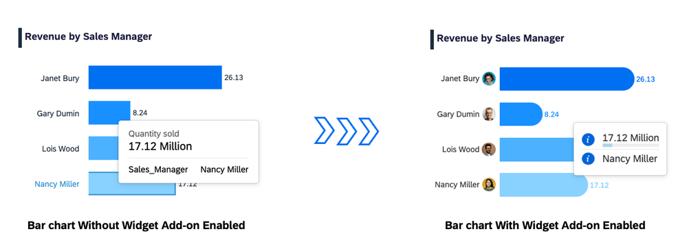
In addition I will highlight a Widget Add-on sample which you can use in order to extend the visual elements of the Built-in charts such a Bar chart, and with that you will have the possibility to modify the Tooltip or the Plot area by overwriting existing visual elements content or style.
Note: this article will be always updated every time we develop new Custom Widget Sample. Feel free to let us know your most requested visualisation that you wish to see as Custom Widget in the future in the comment section. Partners and Customers who wants to include their Custom Widget or Widget Add-on samples in this article, they can contact me so I can refer to their blog posts, and with that we can gather more type of visualisation and make it visible for everyone.
Custom Widget Samples: Preview
The Custom Widget Samples that I will preview in this article, are ready to be used within your Story. You can download the resource files and then upload it into your SAC tenant.
You can edit the Custom Widgets by modifying the source code from the resource files if it's required or even extend the Custom Widget by adding new web component files like: Styling.js, in case you wish adding some new settings to the sample. So let's get started with the first preview of our Samples.
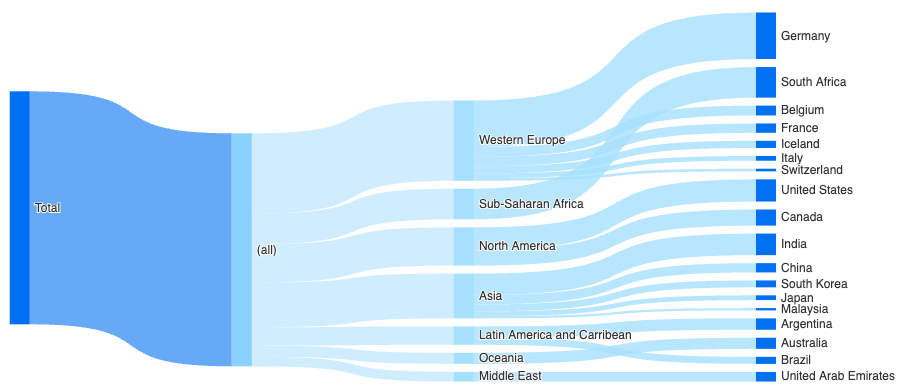
Sankey Chart
You can download the Sankey Chart from here, upload it into your SAC tenant, add it to your Unified Story Experience (Optimized mode), from the builder panel, select your data model, set measure, set an hierarchical dimension and edit the default colors of the different depths from the Styling panel.
You can refer to this sample in case you want to understand how to add new settings into the Styling panel by creating the Styling.js file.
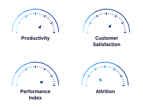
Gauge Chart
You can download the Gauge Chart from here, upload it into your SAC tenant, add it to your Unified Story Experience (Optimized mode), from the builder panel, select your data model, set your measure and from the styling panel set your threshold.
Custom Pie Chart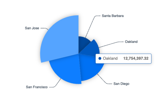
You can download the Custom Pie Chart from here, upload it into your SAC tenant, add it to your Unified Story Experience (Optimized mode), from the builder panel, select your data model, set your measure and your dimension.
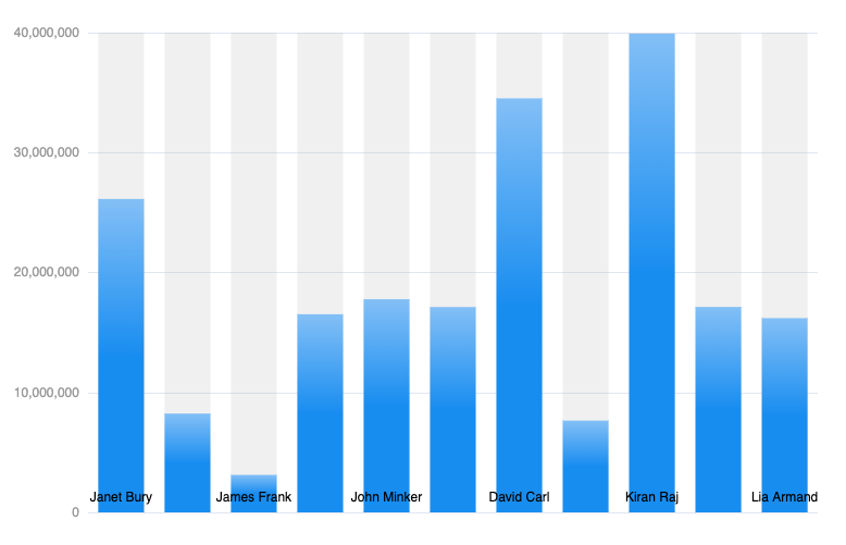
Bar Gradient Chart
You can download the Bar Gradient Chart from here, upload it into your SAC tenant, add it to your Unified Story Experience (Optimized mode), from the builder panel, select your data model, set your measure and your dimension.
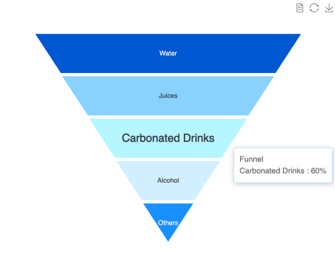
Funnel Chart
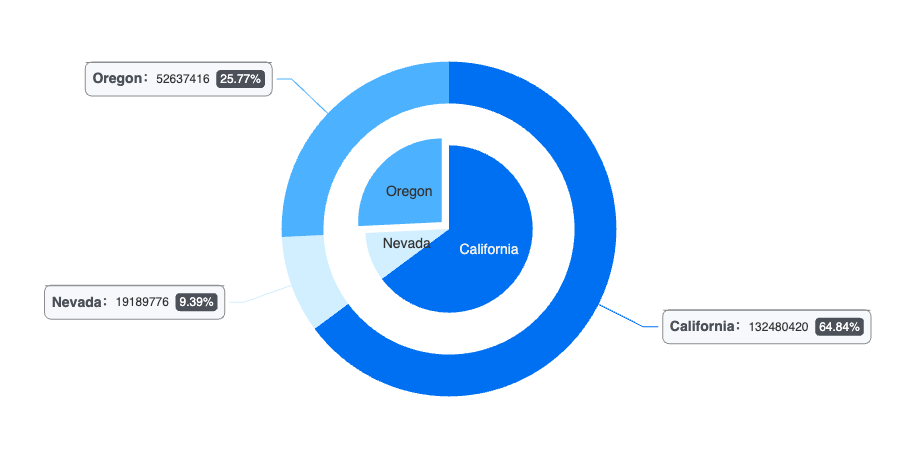
Nested Pie Chart
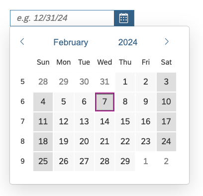
Datepicker
You can download the Datepicker from here. This Custom Widget provides a sophisticated input field for date values and date ranges. The date formatting is customizable and a dark mode is provided.
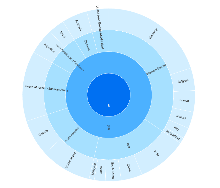
Sunburst Chart
You can download the Sunburst Chart from here, upload it into your SAC tenant, add it to your Unified Story Experience (Optimized mode), from the builder panel, select your data model, set measure, set an hierarchical dimension and edit the default colors of the different depths from the Styling panel.
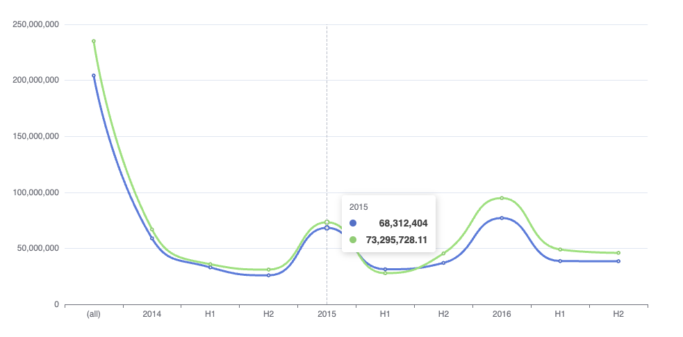
Line Chart
You can download the Line Chart from here, upload it into your SAC tenant, add it to your Unified Story Experience (Optimized mode), from the builder panel, select your data model, set your measure and your dimension.
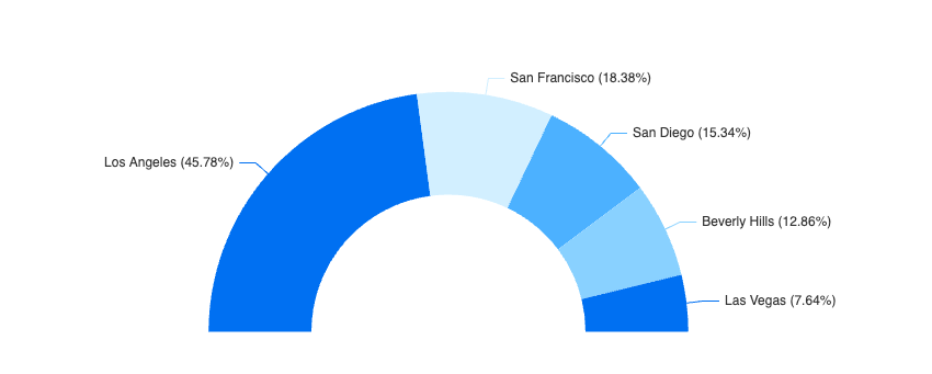
Half Doughnut Chart
You can download the Half Doughnut Chart from here, upload it into your SAC tenant, add it to your Unified Story Experience (Optimized mode), from the builder panel, select your data model, set your measure and your dimension.
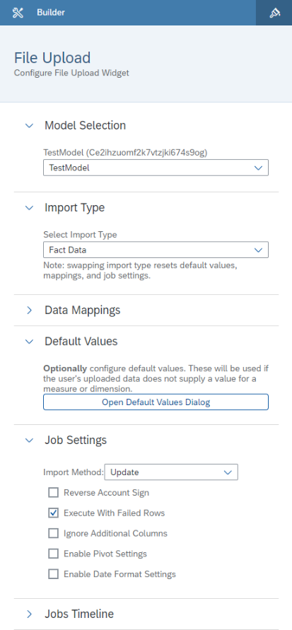
File Upload Widget
The file upload widget extends upon the Data Import API to allow users to upload their FactData CSV or Excel datasets to public and private versions. The widget serves as an intermediary tool, parsing the file and sending the data contained within it to the Data Import API. You can refer to this blog to know more about this Custom Widget.
World Cloud by Input
You can download the World Cloud Chart from here, upload it into your SAC tenant, add it to your Unified Story Experience (Optimized mode), from the builder panel, you can pass your text and press the apply button.
Widget Add-on Samples: Preview
The Widget Add-on Samples are also ready to be used within your Story. You can download the resource files and upload it into your SAC tenant, then from the builder panel you can add the widget add-on to the supported charts to modify the tooltip or the plot area. Learn more how to enable the widget add-on within your story here.
Sample 1
You can download this sample from here, upload it into your SAC tenant, add your supported chart (such Bar chart) into the canvas, enable the widget add-on from the builder panel and add your plot area and tooltip. you can edit either the tooltip or the plot area in the design time, but modify the settings from the builder panel, for example you can change the default icons with your own ones.
More blogs to check out 👇
- How to use Linked Analysis with Custom Widget
- Custom Widget Hands-on Guide 2023
- Announcing the new SAP Analytics Cloud feature: Widget Add-on
- Hosting and Uploading Custom Widgets Resource Files into SAP Analytics Cloud
- Custom Widget Samples GitHub Repository
- SAP Managed Tags:
- SAP Analytics Cloud
You must be a registered user to add a comment. If you've already registered, sign in. Otherwise, register and sign in.
-
ABAP CDS Views - CDC (Change Data Capture)
2 -
AI
1 -
Analyze Workload Data
1 -
BTP
1 -
Business and IT Integration
2 -
Business application stu
1 -
Business Technology Platform
1 -
Business Trends
1,658 -
Business Trends
93 -
CAP
1 -
cf
1 -
Cloud Foundry
1 -
Confluent
1 -
Customer COE Basics and Fundamentals
1 -
Customer COE Latest and Greatest
3 -
Customer Data Browser app
1 -
Data Analysis Tool
1 -
data migration
1 -
data transfer
1 -
Datasphere
2 -
Event Information
1,400 -
Event Information
67 -
Expert
1 -
Expert Insights
177 -
Expert Insights
301 -
General
1 -
Google cloud
1 -
Google Next'24
1 -
GraphQL
1 -
Kafka
1 -
Life at SAP
780 -
Life at SAP
13 -
Migrate your Data App
1 -
MTA
1 -
Network Performance Analysis
1 -
NodeJS
1 -
PDF
1 -
POC
1 -
Product Updates
4,577 -
Product Updates
346 -
Replication Flow
1 -
REST API
1 -
RisewithSAP
1 -
SAP BTP
1 -
SAP BTP Cloud Foundry
1 -
SAP Cloud ALM
1 -
SAP Cloud Application Programming Model
1 -
SAP Datasphere
2 -
SAP S4HANA Cloud
1 -
SAP S4HANA Migration Cockpit
1 -
Technology Updates
6,873 -
Technology Updates
430 -
Workload Fluctuations
1
- Sapphire 2024 user experience and application development sessions in Technology Blogs by SAP
- Govern SAP APIs living in various API Management gateways in a single place with Azure API Center in Technology Blogs by Members
- SAP Analytics Cloud: Support Universal Account Model (UAM) with Custom Widget in Technology Blogs by SAP
- Improving Time Management in SAP S/4HANA Cloud: A GenAI Solution in Technology Blogs by SAP
- Kyma Integration with SAP Cloud Logging. Part 2: Let's ship some traces in Technology Blogs by SAP
| User | Count |
|---|---|
| 28 | |
| 17 | |
| 15 | |
| 13 | |
| 11 | |
| 9 | |
| 8 | |
| 8 | |
| 8 | |
| 7 |

